admin
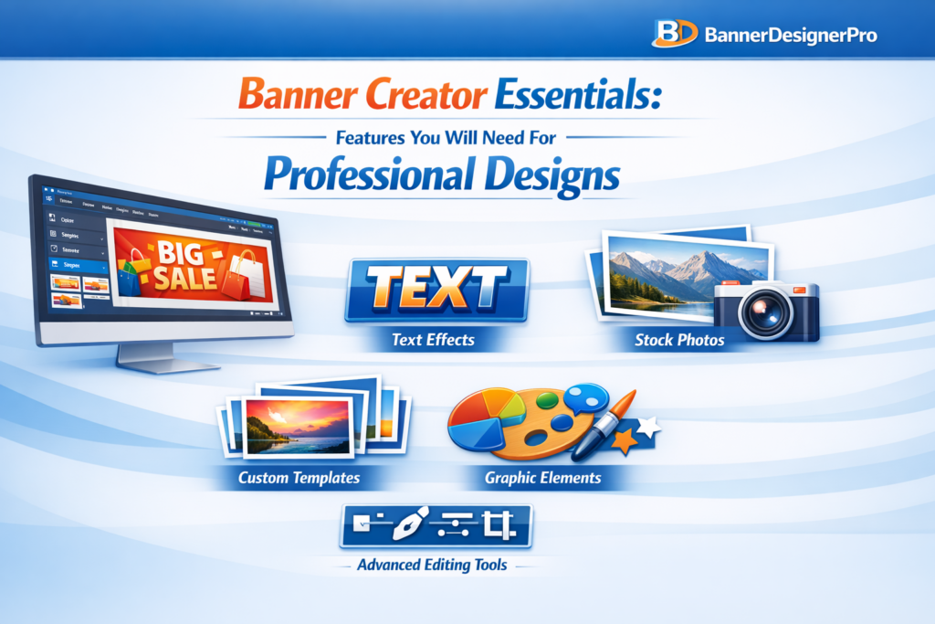
Banner Creator Essentials: Features You Need for Professional Designs
In a digital environment saturated with visuals, banners play a critical role in capturing attention. Whether displayed on websites, social media platforms, or ad campaigns, banners often serve as the first visual interaction between a brand and a potential customer. Their job is simple but demanding: attract attention, communicate value, and encourage action within seconds.
Creating banners that achieve this consistently is not about luck or artistic talent alone. It depends heavily on the tools used to design them. A banner creator is more than just software. It is the foundation of your visual workflow and a key factor in the quality of your final designs.
This guide explores the essential features every professional banner creator should offer and explains why each one matters. Whether you are a marketer, business owner, or designer, these capabilities will help you create banners that look polished, intentional, and effective.
Why Choosing the Right Banner Creator Matters
Even the strongest visual concept can fail if the tool behind it limits precision or efficiency. A well-designed banner creator supports creativity while removing friction from the design process. It allows ideas to move quickly from concept to execution without technical obstacles.
The right tool helps you:
-
Design faster without sacrificing quality
-
Maintain visual consistency across campaigns
-
Adapt banners for multiple platforms easily
-
Produce professional results without complex workflows
Understanding which features are essential helps you avoid tools that look appealing but fall short in real-world use.
Intuitive and User-Friendly Interface
An intuitive interface is the foundation of any effective design tool. If a banner creator is difficult to navigate, it slows creativity and increases frustration.
A strong interface should include:
-
A clean and organized layout
-
Drag-and-drop functionality
-
Logical grouping of tools
-
Smooth performance without lag
An easy-to-use interface reduces the learning curve and allows designers to focus on creativity instead of technical navigation.
High-Quality Pre-Designed Templates
Templates are not shortcuts. They are professional starting points that speed up the design process and ensure consistent results.
High-quality templates:
-
Save time on layout creation
-
Help non-designers produce professional designs
-
Ensure correct sizing for specific platforms
-
Maintain visual balance and hierarchy
Professional templates should feature clean typography, balanced composition, modern styles, and high-resolution assets.
Advanced Typography Tools
Typography is essential to how banners communicate messages. A banner creator should offer more than basic font selection.
Essential typography features include:
-
A wide font library
-
Custom font uploads
-
Letter spacing and line height controls
-
Text effects such as shadows or outlines
-
Support for curved or path-based text
Good typography improves readability and reinforces brand tone without overwhelming the design.
Robust Image Editing Capabilities
Professional banners require more than basic image placement. Integrated editing tools eliminate the need for external software.
Key image editing features:
-
Brightness, contrast, and saturation adjustments
-
Cropping and resizing tools
-
Background removal
-
Filters and presets
-
Transparency and masking options
These tools help ensure visuals look polished and cohesive within the banner.
Layer Management for Design Precision
Layer control is essential for complex banner designs. Without proper layer management, adjusting elements becomes inefficient.
A professional banner creator should support:
-
Layer reordering
-
Grouping and locking layers
-
Opacity controls
-
Visibility toggles
-
Blend modes
Layer-based design enables flexibility and precision at every stage of the creative process.
High-Resolution Export Options
Export quality determines whether a banner looks professional or amateur. Blurry or compressed visuals undermine credibility.
A strong banner creator should offer:
-
High-resolution exports
-
Transparent background support
-
Multiple file formats (PNG, JPG, PDF, SVG)
-
Print-quality export options
Clear exports ensure banners look sharp across all platforms and devices.
Custom Size Creation
Professional design work rarely fits standard dimensions. A banner creator must allow full control over canvas size.
Important sizing features:
-
Manual width and height input
-
Preset sizes for major platforms
-
Automatic resizing options
Flexible sizing ensures banners adapt to any use case without distortion.
Color Tools for Brand Consistency
Consistent color usage is essential for brand recognition.
Effective color tools include:
-
Hex and RGB input
-
Saved color palettes
-
Gradient builders
-
Eyedropper tools
-
Brand kits for teams
These features ensure consistent branding across all designs.
Graphic Elements and Icon Libraries
Design elements add depth and visual interest to banners. Built-in asset libraries reduce reliance on external resources.
Useful elements include:
-
Shapes and frames
-
Icons and illustrations
-
Decorative graphics
-
Badges and callouts
Support for custom asset uploads adds flexibility for advanced users.
AI-Powered Features for Faster Workflows
AI tools enhance productivity by automating repetitive tasks.
Helpful AI features include:
-
Background removal
-
Image enhancement
-
Layout suggestions
-
Automatic resizing
-
Text-to-image generation
AI does not replace creativity. It removes technical friction so designers can focus on messaging and structure.
Collaboration and Cloud Access
Modern design workflows often involve teams. Collaboration tools streamline communication and version control.
Key collaboration features:
-
Real-time editing
-
Commenting tools
-
Shared asset libraries
-
Version history
-
Cloud storage with cross-device access
Cloud-based tools ensure flexibility and continuity across devices.
Integration with Marketing Platforms
A banner creator should fit seamlessly into your existing workflow.
Valuable integrations include:
-
Content management systems
-
Social media platforms
-
Cloud storage services
-
Email marketing tools
Integrations reduce manual steps and speed up deployment.
Flexible Pricing and Licensing
A professional banner creator should offer pricing that matches your needs.
Consider:
-
Free plan availability
-
Monthly and annual options
-
Team pricing
-
Commercial usage rights
The best tool is not always the most expensive, but the most efficient for your workflow.
Conclusion
In a visual-first digital world, banners play a decisive role in brand perception and conversion. Choosing the right banner creator is not a cosmetic decision. It directly impacts efficiency, consistency, and quality.
A professional banner creator should combine ease of use, strong design tools, AI-powered efficiency, flexible exports, and collaboration features. When your tool supports creativity instead of limiting it, banners become more than visuals. They become strategic assets.
With the right features in place, your designs move beyond decoration and into effective visual communication.
Logo Banner Creator Tips: Designing Branded Banners That Stand Out
In the fast-paced digital world, visuals appear in an instant—your banner often serves as the first handshake between brand and audience. In the split second before a visitor scrolls away, the banner has one mission: spark attention and communicate brand identity. A well-designed banner drives clicks, converts users, and shapes brand perception. A weak one gets lost in the noise.
Designing a standout, brand-defining banner takes more than dropping a logo on a shape. It demands strategy, psychology, design order, and an understanding of visual processing. Whether you use a creator tool, templates, or a blank canvas, the right tips elevate your work from “fine” to “memorable.”
Below, we explore tactics and principles for making branded banners noticeable.
Why Branded Banners Matter More Than Ever
Brand banners are everywhere: websites, email headers, storefronts, social media profiles, YouTube channels, product listings, event pages, and ads. Because they’re so common, your audience’s brain has trained itself to ignore weak or generic designs. This is where strong branding becomes your advantage.
A strong banner should reinforce brand recognition using consistent visual cues central to your identity.
- It needs to deliver an emotional impression that specifically matches your brand’s tone.
- The primary goal: communicate your core message in seconds.
- Design hierarchy guides users’ attention effectively across the banner content.
- Achieve trust and credibility with a clean, professional design throughout.
When logo, typography, colors, and message unite seamlessly, they form a memorable brand signature.
Start With a Strong Understanding of Your Branding
Before you even open a logo banner creator tool, step back and evaluate your brand elements. Are they unified? Do they reflect the brand personality?
Know Your Core Brand Colors
Use your brand colors so users quickly identify your business. Limit main colors to two or three with one accent if needed.
Use Consistent Typography
Your fonts should match your brand’s personality—clean and geometric for tech brands, elegant serifs for lifestyle businesses, and bold sans serifs for modern, youthful brands. When mixing fonts:
- Use one for headings.
- One for body or supporting text
- And avoid using more than two.
Logo Placement Rules
Your logo must be visible yet subtle. Oversizing weakens the overall design.
- Place it in the corner, or
- Integrate it into the main focal point.
- Ensure your logo stays crisp and clear at all sizes, using suitable placement for balance.
Use a High-Quality Banner Creator Tool
The correct tool can improve your design and streamline your workflow. Popular logo banner creator tools include:
- Canva
- Adobe Express
- Snappa
- VistaCreate
- Fotor
- Stencil
These tools offer templates, drag-and-drop elements, and platform-ready sizes.
Choose Tools That Offer:
- High-resolution export options
- Transparent background support
- Precise alignment and spacing controls
- Vector logo compatibility
- Color HEX customization
Remember: amateur tools yield amateur results. For branded work, use premium accounts.
Use Visual Hierarchy to Guide Attention
Every banner should feel like a guided experience. Your viewer’s eye should flow from the logo to the headline, then to any supporting text, and finally to a call to action (CTA).
Hierarchy Techniques That Work
- Size contrast: Bigger elements draw attention first. Use scale strategically.
- Color contrast: High-contrast highlights, low-contrast backgrounds.
- Whitespace: Allow elements to breathe—crowded banners look cheap.
- Positioning: Place key content in “hot zones” (upper left, centered, or near focal intersections).
A common trick is using the “Inverted Pyramid Layout”:
- Bold headline at the top
- Supporting message in the middle
- CTA at the bottom
This mirrors how humans scan information, especially online.
Create a Banner Message That’s Short, Punchy, and Clear
Text is a blessing and a curse; the more you use it, the less people read.
You need:
- One main headline
- Optional micro-text (subheading)
- One call-to-action at most
Craft Headlines That Pop
Your headline must be:
- Specific
- Value-driven
- Action-oriented
- Easy to digest in under 2 seconds
Examples:
- “Upgrade Your Workflow Today”
- “Limited-Time Offer: 50% Off” “Create Stunning Graphics in Minutes” Short. Direct. Powerful.
Use Color Contrast to Make the Banner Instantly Noticeable
Your banner should attract attention naturally. Smart contrast boosts impact.
Here’s how to use it wisely:
Choose a Strong Background
Solid colors, gradients, patterns, or blurred images all work—just don’t let the background overpower your text.
Contrast Your Text and Elements
Light text works on dark backgrounds. Dark text works on light backgrounds.
Red text on a bright red background? Hard pass.
Use Accent Colors for CTAs
You want the call-to-action button—or CTA wording—to pop. Pick a color that contrasts with the background and aligns with your brand.
Optimize Your Banners for the Platform They’ll Be Displayed On
Different platforms require different banner sizes. A banner for your website may not display well on Instagram or YouTube.
Common Banner Dimensions
- Facebook Cover: 820×312 px
- YouTube Channel Art: 2560×1440 px
- Website Hero Banner: ~1600×600 px
- Email Header: ~600×200 px
- LinkedIn Banner: 1584×396 px
- Pinterest Pin: 1000×1500 px
Each platform has quirks, so design with them in mind.
Always Export in High Resolution
Small banners must also remain crisp.
Pixelation destroys credibility.
Balance Illustrations, Images, and Graphics
Many logo banner creators offer stock images and shapes, but the wrong visual elements can clutter or distract.
For banners, less is more.
Use Visuals That Support Your Message
If your banner promotes travel services, show a breathtaking landscape.
If it’s announcing a webinar, feature the speaker.
If it’s about a tool or product, show the actual item.
Avoid:
- Busy backgrounds
- Cheesy stock photos
- Irrelevant icons
- Random decorative shapes that serve no purpose
Always tie visuals back to your brand identity and message.
Use Whitespace as a Strategic Design Tool
Whitespace is not “empty space.” It’s a deliberate breathing room that enhances structure and focus.
Whitespace helps:
- Separate elements
- Improve readability
- Create balance
- Highlight priority content
- Build a premium look.
Overcrowded banners make users feel overwhelmed—even if the elements are good individually.
Keep Your Logo Clean, Clear, and Present
Your logo needs to look sharp at all sizes. Many brands make errors like:
- Uploading low-resolution logos
- Using outdated versions
- Using logos with cluttered backgrounds
- Overshadowing the banner message with oversized logos
Tips for Perfect Logo Display
- Use PNG or SVG for crisp, clear results.
- Make sure the background is transparent.
- Don’t stretch or distort the logo.
- Ensure there’s enough padding around it.
Remember: your logo is the anchor, not the brand.
Add a Strong CTA (When Appropriate)
Not every banner needs a CTA, but many do—especially promotional or advertising banners.
Effective CTAs Use:
- Action verbs (Get, Try, Download, Subscribe)
- Short phrases
- High contrast colors
- Strategic placement
Examples:
- “Start Free Trial”
- “Download Guide”
- “Learn More”
A banner without a CTA is often a missed opportunity.
Test, Analyze, and Improve
Top brands never rely on guesswork—they test everything.
What to Test:
- Color variations
- Different CTA text
- Shorter vs. longer headlines
- Different visual layouts
- Logo sizes and placements
You may find that one version performs drastically better than another, even with small changes.
Keep File Sizes Light Without Sacrificing Quality
Large banners can slow page load times, affecting SEO and user experience. Compress your banner images without losing sharpness.
Best Formats:
- PNG for logos and text
- JPEG for complex images
- WebP for a speed and quality balance
Aim for the shortest file size that maintains a sharp appearance.
Understanding Brand Psychology: How Colors, Shapes, and Style Influence User Perception
Behind every banner that grabs attention is a subtle layer of psychology. Humans process visuals before words. Your design choices—colors, shapes, spacing, and textures—send subconscious signals. They influence how your audience feels about your brand.
Color Psychology in Banner Design
- Blue evokes trust, professionalism, and intelligence—ideal for corporate, finance, or tech brands.
- Red creates urgency and excitement; great for sales or fast-action campaigns.
- Green feels natural, refreshing, and balanced; ideal for wellness and eco brands.
- Black and gold scream luxury and exclusivity.
- Pastels suggest calmness, approachability, and softness.
The message and tone of the banner will be perfectly harmonious if you use colors that complement your brand’s identity.
The Psychology of Shapes
- Rounded shapes signal friendliness and community.
- Angular shapes convey precision, structure, and seriousness.
- Geometric patterns communicate modernity and innovation.
When these psychological cues align, your banner conveys powerful emotional meaning without a single word.
Incorporating Motion Graphics and Animation (When Platforms Allow It)
Static banners are powerful, but animated banners can captivate by introducing movement—one of the strongest attention-grabbers in visual design. Motion creates intrigue.
Subtle Animations That Enhance Engagement
- Soft fade-ins for text
- Gentle logo reveals
- Floating or drifting elements
- Hover animations for CTAs
Keep motion minimal. Overly flashy animations look amateurish and distract from your brand. The goal is to enhance, not overwhelm.
Use Cases Where Animated Banners Shine
- Email headers
- Website hero sections
- Social ads
- Video channel intros
Remember: ensure the animation loops smoothly and does not exceed file size limits.
Creating Mobile-Responsive Banner Variations
A banner that looks stunning on desktop can collapse—visually and functionally—on mobile if not properly optimized.
Mobile-First Banner Design Rules
- Prioritize readability at smaller scales.
- Increase padding; smaller screens need more breathing room.
- Use larger fonts and fewer words.
- Ensure the logo remains crisp, not pixelated.
Nearly half of online traffic is mobile. If your banners aren’t responsive, you’re losing visibility and diminishing user trust.
Accessibility in Banner Design: Make Your Visuals Inclusive
Many designers forget to optimize banners for accessibility, yet accessibility is essential for usability, brand reputation, and legal compliance.
Accessibility Best Practices
- Use color contrast ratios that meet WCAG standards.
- Avoid text embedded in busy backgrounds.
- Make sure CTAs are distinguishable even for color-blind users.
- Keep font sizes readable (at least 16–18px for mobile).
- Add descriptive alt text when uploading banners to websites.
Inclusive design isn’t just ethical—it expands your audience reach.
Incorporating Brand Storytelling into Your Banners
Great banners do more than display a logo and headline—they whisper a deeper message about your brand’s promise, values, and identity.
Ways to Add Storytelling Elements
- Use imagery that reflects your mission or audience lifestyle.
- Choose color palettes that echo your brand’s emotional tone.
- Include micro-copy that hints at your value proposition.
- Show real people or real product use (avoid overly staged stock photos).
A banner may contain only a few words, but the story it tells can instantly shape user perception.
How Template Customization Improves Branding Consistency
Logo banner creator tools often provide templates—but templates are only a starting point, not a final product. Customization transforms them from “generic” to “uniquely yours.”
Areas to Customize:
- Colors
- Fonts
- Spacing and layout
- Image style
- CTA placement
- Branding elements (patterns, textures, icons)
Templates give structure. Customization gives soul.
Advanced Composition Techniques for High-Impact Banners
If you want your banners to stand out at a premium, professional level, incorporate advanced composition techniques:
Rule of Thirds
Divide the canvas into a 3×3 grid. Place key elements at intersections to create a natural visual flow.
Golden Ratio
A timeless proportion used by artists. It creates pleasing balance and elegance in your layout.
Z-Pattern Scanning
Western audiences typically scan visuals in a Z-shape. Use this flow to place:
- Logo in the upper-left
- Headline across the top
- Imagery diagonally
- CTA in the bottom-right
These small decisions dramatically influence engagement.
Common Banner Design Mistakes to Avoid
Strong banners stand out not only because they’re well-designed, but also because they avoid the pitfalls that make so many designs fall flat.
Mistakes to Watch Out For
- Overloading the banner with text
- Using too many graphics
- Choosing low-resolution images
- Ignoring spacing and alignment
- Clashing colors or unreadable fonts
- Inconsistent branding across platforms
- Poor CTA placement
- Relying solely on stock visuals
Sometimes, eliminating mistakes is more powerful than adding flourishes.
Developing a Brand Banner Style Guide for Long-Term Consistency
If your business creates multiple banners across social media, ads, websites, and email campaigns, a style guide is essential.
Include Guidelines For:
- Logo placement rules
- Minimum logo size and padding
- Color palette and acceptable variations
- Approved font combinations
- Alignment and spacing rules
- Imagery and visual themes
- CTA button styles
- Templates for different banner types
A strong banner today is great. A consistent banner identity across months or years? That builds a recognizable brand.
Repurposing Your Banner Designs Across Multiple Channels
Designing a standout banner takes time—so leverage it across platforms.
How to Repurpose Efficiently:
- Convert a website banner into a Facebook cover.
- Adapt social media banners for YouTube channel art.
- Turn a promotional banner into an email header.
- Use the same format for ads, product pages, and landing pages.
Repurposing ensures branding consistency and saves hours of design labor.
FAQs
What is the purpose of a branded banner?
A branded banner reinforces your brand identity, captures attention quickly, and communicates your message in a visually compelling way.
How big should my logo be on a banner?
Keep the logo visible but not overpowering. Aim for a balanced size that’s clear without distracting from the main message.
What colors work best for banner design?
Use your brand colors and incorporate strong contrast to improve readability and visual impact.
How much text should a banner have?
Keep it minimal—one main headline, an optional subheading, and a short call-to-action.
Should I use templates in banner creator tools?
Yes, but always customize them to maintain originality and brand consistency.
How do I make sure my banner looks good on mobile?
Increase font size, simplify elements, and test how it scales on smaller screens.
Why does file format matter?
The right format ensures clarity and fast loading. PNG is ideal for logos; JPEG or WebP works for photos.
Do banners need a CTA?
Not always, but banners promoting offers, products, or events benefit from a clear, action-focused CTA.
How often should I update my banners?
Update banners for new promotions, seasonal campaigns, or branding changes to keep visuals fresh.
Can AI help with banner creation?
Yes—AI tools can help with layouts, color choices, and quick variations, making the design process faster and easier.
Conclusion
Designing a standout banner isn’t about the flashiest colors or trendiest fonts. It’s about clarity, brand consistency, emotional resonance, and visual strategy. When your audience sees your banner—whether on a website, social media profile, email header, or advertisement—they should immediately feel the essence of your brand.
A banner should communicate, not confuse. It should attract, not overwhelm. And above all, it should feel unmistakable to you.
Using these tips—combined with a high-quality banner creation tool—ensures that every visual you produce reflects professionalism, personality, and purpose.
How to Optimize Banner Ads for Faster Load Time and Better Performance
Banner ads may seem simple—rectangles, images, a splash of color, a short pitch. Yet behind these deceptively small visuals lies an entire ecosystem of performance considerations that can make or break a campaign. A banner ad that loads late, lags behind page elements, or displays poorly on certain devices doesn’t merely annoy a user; it directly sabotages your return on ad spend. In the fast-moving, distraction-heavy world of digital browsing, milliseconds can determine whether an impression converts or evaporates.
Today’s users won’t wait. Pages that take more than three seconds to load lose over half their visitors, and ads are no exception. Faster loading banner ads don’t just play nicer with the host website—they dramatically boost engagement, click-through rates, viewability, and overall ad relevance scores across major platforms.
So how do you streamline your banner ads to ensure they load quickly and perform at their peak? Let’s unpack the full process, layer by layer, exploring both technical and strategic optimizations that elevate your banners from “good enough” to “consistently outperforming.”
Why Load Time Matters More Than Ever
Speed isn’t just a technical detail; it’s a psychological experience. When users perceive a page as slow, they disengage instantly. No deep logic required—it’s instinctual. Banner ads compete in a ruthless attention economy where every blink counts. When your banner lags, even by a fraction of a second, several issues arise:
- Reduced visibility due to delayed rendering
- Banner blindness is triggered when ads appear after the user has shifted focus.
- Lower viewability scores, which impact programmatic bidding
- Poor user experience, especially on mobile
On high-traffic websites, these micro-delays accumulate into macro-losses—lost impressions, lost clicks, and lost conversions.
The takeaway: optimizing banner load time isn’t optional; it’s integral to maintaining competitive performance in modern digital advertising.
Compress Your Image Assets Without Destroying Quality
Images are often the biggest culprits behind slow-loading banner ads. Even a visually tiny ad can take up a surprisingly large file size if created without best-practice compression.
Use Modern Image Formats
Technologies evolve, and so should your image files. Formats like:
- WebP
- AVIF
offer drastically reduced file sizes with no noticeable drop in quality. In many cases, switching from PNG or JPG to WebP can instantly reduce file size by 30–50%.
Be Ruthless About Compression
High-quality visuals don’t require bloated files. Use tools such as:
- TinyPNG
- ImageOptim
- Squoosh
Aim to keep banner image files under 150 KB, and ideally even lower for mobile formats.
Minimize Color Depth and Remove Metadata
Metadata eats space and adds no visual benefit. Reducing unnecessary layers or color profiles also helps shave off kilobytes.
The paradox is fascinating: lighter images don’t just load faster—they often perform better because users actually see them in time to respond.
Optimize HTML5 Banner Ads with Lean Code
If you’re running HTML5 banners, your codebase can either accelerate or choke performance. Many advertisers don’t realize how bloated HTML5 banners become when built with drag-and-drop tools or exported without cleanup.
Minify Everything
- Minify CSS
- Minify HTML
- Minify JavaScript
This removes whitespace, comments, and unused code—resulting in significantly smaller files.
Reduce DOM Elements
The fewer nodes, the better. Streamline:
- Images
- Layers
- Animation frames
Complexity increases loading times exponentially in HTML5 environments.
Use Lightweight Libraries (Or None at All)
Avoid full-scale frameworks unless absolutely necessary. Stick to native JavaScript when possible. Libraries like GSAP can be powerful, but they must be used with precision.
Simplify and Streamline Animations
Animation brings banner ads to life—yet it can also bog them down. Overly elaborate transitions, frame-heavy sequences, or timing errors can all increase load time and reduce performance.
Prioritize Your Key Message
Lean animation isn’t boring; it’s strategic. Focus on:
- Smooth fades
- Simple slide-ins
- Subtle emphasis cues
These consume far fewer resources and remain visually effective.
Limit Animation Duration
Studies show that animations longer than 6–8 seconds are often ignored. Shorter animations load faster, re-loop more cleanly, and retain user engagement.
Compress Sprite Sheets
If you rely on animated sprites, reduce their dimensions and remove any unused frames.
Animation should enhance your message—not compete with the load time budget.
Lazy Loading and Smart Delivery Techniques
Lazy loading prioritizes page content, rendering ads only when they’re about to enter the user’s viewport. This tactic not only increases perceived page speed but also improves viewability automatically.
Use Intersection Observers
This JavaScript feature detects when an ad becomes visible, triggering the load at precisely the right moment.
Host Banners on Fast CDNs
Content Delivery Networks reduce latency by storing assets closer to end-users. This alone can dramatically reduce loading times across geographic regions.
Preloading Critical Assets
If your banners appear above the fold, preloading key components signals the browser to prioritize them.
Smart delivery is a balancing act—load fast enough to gain attention without degrading page performance.
Reduce the Number of Tracking Tags and Third-Party Scripts
Every tracking script, pixel, or verification tag adds weight. The more you pile on, the slower your banner loads. While analytics and tracking are essential, they must be implemented intentionally.
Consolidate Tracking Tools
Use tag management systems like:
- Google Tag Manager
- Tealium
to combine multiple tracking needs into a single deployment layer.
Avoid Redundant Tracking
Running three different analytics systems to capture the same metric creates unnecessary overhead.
Prioritize First-Party Measurement
Emerging privacy standards make first-party data not only safer but also faster.
Third-party scripts are notorious performance bottlenecks—trim aggressively.
Use Ad Server Compression and Caching
Modern ad servers offer automatic compression and caching, yet many advertisers overlook these benefits.
Enable Server-Side Compression
Formats like GZIP and Brotli compress assets before delivery, dramatically improving load times.
Use Browser Caching Headers
Setting appropriate TTL (time-to-live) values allows the user’s device to cache banner elements locally. On repeat visits, banners load almost instantly.
Ensure Proper Cache Busting
Update file names or use query strings whenever new creative versions are published. This prevents old assets from persisting unintentionally.
Choose Banner Sizes That Load Efficiently
Some ad sizes inherently load faster due to their dimensions, aspect ratios, or popularity across ad exchanges. Using standardized, widely supported sizes increases compatibility and speeds up rendering.
Common faster-loading sizes include:
- 300×250
- 728×90
- 160×600
High-performance networks often prioritize these units, leading to better placement and faster load times.
Avoid overly large or uncommon dimensions unless required for special campaigns.
Improve Performance with Strong File Organization and Version Control
This may seem like an operational detail, but proper asset management often separates high-performing campaigns from chaotic, under-optimized ones.
Keep File Naming Clean and Clear
Avoid cryptic names like “banner_final_final_v9.” Instead, structure logically:
clientname_campaignsize_version.webp
Maintain a Version Log
Track what changed between versions—especially when testing different load speeds.
Use Asset Pipelines
Automated build tools ensure each export is:
- Minified
- Compressed
- Cleaned
- Validated
This eliminates human error and guarantees consistent optimization.
Test Continuously—Not Once, Not Twice, but Continuously
Testing is the heartbeat of banner optimization. Without it, you’re guessing.
Use Tools to Measure Load Time
Consider:
- Google Lighthouse
- WebPageTest
- GTmetrix
Each provides unique insights into render-blocking elements, heavy scripts, and load order inefficiencies.
Evaluate Banner Performance Across Multiple Devices
A banner that looks crisp on a desktop might struggle on older phones. Mobile browsers often have stricter memory limits.
A/B Test Creative and Technical Variations
Swap:
- Image formats
- Animation lengths
- Color palettes
- CTA positions
Even tiny changes can influence load speeds and performance metrics.
Focus on Creative Simplicity Without Compromising the Message
Some advertisers fall into the trap of over-designing banners as if complex visuals equate to higher conversions. But simplicity is often the secret weapon.
Prioritize Clarity
A banner ad has one job: to communicate a message instantly. Clutter slows comprehension and file loading.
Use High-Contrast Colors
Bold, clean visuals load faster and capture attention more effectively.
Short, Punchy Copy Works Best
Long text blocks inflate asset size and overwhelm users. Concise is powerful.
Optimize Click-Through Performance in Tandem with Load Time
Fast load time is useless if your ad doesn’t perform. The best strategy intertwines speed and persuasion.
Use a Strong Call-to-Action (CTA)
Short, actionable verbs work best:
- Learn More
- Get Offer
- Start Now
Ensure CTA Placement Appears Early in the Animation
Don’t hide your CTA behind a 4-second intro. Users have no patience.
Design for Scanability
Humans skim first, process later. Banner ads must communicate before the user consciously decides to engage.
Leverage Programmatic Advertising Settings to Improve Load Efficiency
While much of banner optimization happens at the creative and technical level, there’s a powerful, often underestimated dimension: programmatic delivery settings. The infrastructure that routes, prioritizes, and displays ads can significantly influence how quickly your banner loads and how effectively it performs. Think of it as tuning the engine, not just polishing the vehicle.
Programmatic systems use algorithms to decide which ads load first, how often they appear, and how they compete in real-time auctions. Misconfigured settings—even subtle ones—can slow delivery, lower viewability, and inflate costs.
Choose High-Performance Inventory Sources
Not all ad exchanges or publisher networks are created equal. Some platforms deliver cleaner, faster-loading inventory, while others are bogged down with script-heavy placements. Prioritizing premium inventory dramatically reduces latency because:
- Fewer ad calls are routed through low-quality networks.
- There’s less risk of running ads in ad-slot environments bloated with competing scripts.
- Page environments tend to be more stable and optimized.
Fast environments amplify fast banners. Slow environments negate even the most optimized creative.
Use Frequency Capping Wisely
Flooding the same user with the same banner repeatedly does more harm than good. It increases server load, wastes impressions, and doesn’t improve conversions. With optimized frequency caps:
- Ad servers make fewer repetitive requests.
- Users see fresh, relevant ads rather than stale repeats.
- You reduce the invisible drag created by unnecessary delivery cycles.
Performance rises when delivery becomes smarter, not broader.
Enable Real-Time Creative Optimization (RCO)
RCO systems dynamically adapt banner versions based on performance, placement, and device type. This automation offers a double advantage:
- It improves load time because systems select the lightest, most performant variant for each environment.
- It boosts conversions because users receive creatives optimized for their context.
RCO blends machine intelligence with human creativity, creating a feedback loop where ads evolve continuously.
Avoid Overly Aggressive Bid Strategies
Bid shading, hyper-aggressive CPM strategies, and rapid re-bidding can inject latency into programmatic delivery. When the system must reassess multiple bid attempts within milliseconds, the load sequence may stall. A clean, balanced bidding strategy ensures:
- Faster auction resolution
- More stable delivery
- Higher viewability because banners render earlier in the page load cycle
Speed begins not when the file loads, but when the auction begins.
Ensure Compatibility With Publisher Ad Servers
Some publishers use older or heavily customized ad servers that require specific formatting. If your banner isn’t built to their specifications, browsers may struggle to interpret:
- Animation formats
- Scripts
- Tracking macros
- Asset bundles
This mismatch causes load delays that advertisers mistakenly blame on their creatives. Ensuring compatibility upfront eliminates these bottlenecks entirely.
FAQs
Why do banner ad load times matter?
Slow-loading ads reduce visibility, increase bounce rates, and significantly lower click-through and conversion performance.
What file size should my banner ads be?
Aim for 150 KB or less, though many high-performing ads fall under 100 KB.
Which image formats load fastest?
Modern formats like WebP and AVIF offer excellent compression with minimal quality loss.
Do animations slow down banner ads?
They can. Using simple, lightweight animations keeps load times fast while maintaining visual impact.
How can I test my banner ad’s load speed?
Tools like Google Lighthouse, WebPageTest, and GTmetrix help identify bottlenecks and optimization opportunities.
Does using too many tracking tags affect performance?
Yes. Excessive third-party scripts slow down rendering and reduce responsiveness.
What’s the easiest way to reduce an ad file size?
Compress images, minify HTML5 code, and remove unnecessary elements or metadata.
Banner Ad Optimization Techniques: Quick Reference Table
|
Optimization Area |
Action to Take |
Performance Benefit |
|
Image Compression |
Use WebP/AVIF and compress to <150 KB |
Faster loading, reduced bandwidth |
|
HTML5 Code Cleanup |
Minify HTML, CSS, JS |
Smaller file size, quicker rendering |
|
Animation Simplification |
Light, short animations (≤ 6–8 seconds) |
Reduced CPU load, smoother playback |
|
Script Reduction |
Limit tracking tags and third-party scripts |
Lower latency, faster display |
|
Smart Delivery |
Use CDNs, lazy loading, caching |
Faster global delivery, better viewability |
|
Programmatic Settings |
Prioritize premium inventory, enable RCO |
Reliability, improved real-time performance |
|
File Organization |
Clean naming and version control |
Consistency, easier optimization cycles |
|
Performance Testing |
Lighthouse, GTmetrix, WebPageTest |
Identifies bottlenecks for ongoing improvement |
Conclusion
Optimizing banner ads for faster load time is not an optional creative enhancement; it’s a core performance strategy. Speed dictates visibility. Visibility fuels engagement. Engagement drives conversions. Each micro-optimization compounds into measurable results—better ROI, more impressions, and stronger brand equity.
In the digital advertising world, the fastest ads are often the most successful. The banners that load instantly steal attention before your competition even appears on the screen.
By compressing assets, cleaning code, simplifying animations, reducing third-party scripts, leveraging advanced delivery techniques, and continuously testing, you build a future-proof advertising strategy that thrives across devices, environments, and platforms.
Fast, lean, persuasive—that is the banner ad trifecta. Master it, and your campaigns won’t just run; they’ll soar.
How to Make Social Media Banners That Match Your Brand: A Complete Guide for Consistent, Eye-Catching Graphics
<?xml encoding="UTF-8">

Social media banners are your brand’s first impression. Instantly judged and rarely given more than a glance, they must quickly engage viewers while communicating professionalism and personality. Success depends on anchoring your design to a clear brand identity.

Yet creating banners that feel cohesive, polished, and unmistakably on-brand is not as intimidating as it seems. It blends strategy, design psychology, and just enough creativity to bring your graphics to life. The approach stays consistent across Facebook, Instagram, LinkedIn, X (Twitter), YouTube, Pinterest, and TikTok: focus on consistency, clarity, and intentionality.

This guide will show you, step by step, how to design consistent social media banners—clearly outlining the most important actions and tools needed, so you leave with actionable takeaways for every stage of the process.

Why Creating Branded Social Media Banners Matters More Than Ever

Before diving into the how, let’s unravel the why. Brands today compete in an attention battlefield where visuals often speak louder than mission statements, product descriptions, or the most eloquently written captions.

Here’s why branded banners matter:

Visual Consistency Builds Trust

People trust what feels familiar. When your banners use the same logo, colors, and design tone, viewers subconsciously identify your content as credible, stable, and recognizable.

Strong Branding Increases Engagement

Eye-catching banners draw viewers in, while cohesive ones foster lasting connections. A consistent look encourages engagement.

They Reinforce Your Identity Across Platforms

A unified banner strategy makes your brand intentional, recognizable, and professional everywhere you appear.

Competitive Differentiation

Most social feeds are chaotic mosaics of mismatched visuals. Your brand’s polished consistency becomes a competitive advantage.

Define Your Brand Identity (Or Revisit It If It Feels Fuzzy)

Think of your brand as a person—real, breathing, expressive. Before you design anything, identify the traits that define your brand.

Ask yourself:
-
What is my brand personality? (Bold? Elegant? Playful? Minimalistic?)
-
What emotions should my visuals evoke?
-
Who am I speaking to?
-
What problem do I solve—or what transformation do I offer?
It’s much easier to design when you have clarity. Without this foundation, your banners will feel disconnected, no matter how technically “good” they are.

Select a Unified Color Scheme That Captures Your Brand

Your color palette is more than just decoration—it’s a psychological tool. Different colors trigger different emotional responses, influencing how viewers perceive your brand at a glance.

Tips for Choosing and Using Colors:
-
Use 1–2 primary brand colors for signature elements.
-
Include 1–3 secondary colors for accents or contrast.
-
Stick to the same HEX codes across all platforms to maintain consistency.
-
For readability, make sure the text and background have a strong contrast.
-
Consider color meanings:
-
Blue → Trust, stability
-
Red → Energy, urgency
-
Black → Luxury, strength
-
Yellow → Optimism, creativity
-
Green → Growth, peace
If your brand already has established colors, use them religiously. If not, tools like Coolors, Adobe Color, or Canva’s palette generator can help create one.

Select Fonts That Match Your Brand’s Voice

Typography is often underrated, yet it’s one of the most expressive parts of visual branding. The right font can elevate a message; the wrong one can undermine it instantly.

Guidelines for Selecting Brand Fonts:
-
Choose one primary font for your main text.
-
Add one complementary font for secondary text, subheadings, or accents.
-
Avoid using more than two fonts—too many create visual chaos.
-
Keep your fonts readable, even on small screens.
-
Make sure your typography matches your identity:
-
Serif fonts → traditional, sophisticated
-
Sans-serif fonts → modern, clean
-
Script fonts → creative, personal
-
Bold geometric fonts → strong, confident
Once chosen, use the same typefaces across all banners to maintain consistency.

Incorporate Your Logo Strategically (Not Excessively)

Your logo is your signature. It should appear on your banners, but not dominate them or distract from key messaging.

Placement Tips:
-
Place your logo in the top right or bottom right corner—people’s eyes naturally end there.
-
Ensure it’s large enough to be recognized but not overpowering.
-
Use alternate versions of your logo (e.g., white, black, icon-only) for design flexibility.
-
Maintain consistent spacing so the logo always feels intentional.
Your goal? Subtle recognition—not a billboard screaming for attention.

Select Pictures That Reflect Your Brand's Principles

Images communicate tone faster than words. Stock photos, lifestyle images, product shots, and illustrations should all feel stylistically consistent.

Ask yourself:
-
Does this image reflect my brand’s personality?
-
Does the tone match my messaging? (Soft, bold, humorous, luxurious, etc.)
-
Is the lighting consistent with other images I use?
-
Does the image support the value I want to communicate?
If your brand uses illustrations instead of real images, keep the style consistent—color intensity, line weight, and character style should all feel cohesive.

Use Design Elements That Reinforce (Not Distract From) Your Brand

Subtle flourishes—icons, shapes, patterns, overlays, gradients—can strengthen your brand identity when used intentionally.

Best Practices:
-
Stick with a defined set of shapes (rounded corners, sharp edges, circles, etc.).
-
Use consistent patterns across banners (waves, stripes, dots).
-
Limit decorative elements to avoid overcrowding the design.
-
Maintain consistent spacing, padding, margins, and alignment.
Each of these small details builds visual harmony—remember this as a key takeaway for a cohesive look.

Tailor Banner Sizes for Each Social Platform

Each platform has its own dimensions, and while the design language stays the same, the layout may change.

Here are common banner sizes (subject to periodic updates):
-
Facebook Cover Photo: 820 × 312 px
-
YouTube Channel Art: 2560 × 1440 px
-
LinkedIn Company Banner: 1128 × 191 px
-
X (Twitter) Header: 1500 × 500 px
-
Pinterest Board Covers: 800 × 450 px
-
TikTok Profile Banner: 1160 × 654 px
Design with the “safe zone” in mind—important elements should be centered to avoid cropping.

Maintain an Easy-to-Scan Layout

Great banner design isn’t about adding more elements—it’s about purposeful simplicity.

Layout Tips:
-
When composing, follow the rule of thirds.
-
Create visual balance with evenly distributed elements.
-
Make your headline (if included) the visual anchor.
-
Leave plenty of whitespace—your design needs room to breathe.
-
Ensure your text is large enough for mobile viewing.
Viewers digest visuals instantly. Keep this takeaway in mind: Cluttered banners lose impact, while clean designs enhance recognition.

Add Text That Communicates Value in Seconds

While not every banner needs text, when you include it, keep it short and powerful.

Effective Text Examples:
-
“Grow Your Business Online”
-
“New Collection Out Now”
-
“Weekly Tutorials & Insights”
Use strong verbs, clear messaging, and value-driven wording. Avoid cluttering banners with full sentences or dense paragraphs—save that for captions and website content.

Use Professional Design Tools to Create Consistent Banners

You don’t need to be a graphic designer to create professional social banners—many tools offer templates and customization features that simplify the process.

Popular Tools:
-
Canva – beginner-friendly with brand kits and templates
-
Adobe Express – great for quick, polished designs
-
Figma – ideal for advanced, collaborative design
-
Photoshop – powerful for custom graphics
-
VistaCreate – great for brand consistency and animation
Where possible, create a brand kit inside your tool: upload your logo, fonts, colors, and design elements so every banner starts with the same foundation.

Create a Banner Template System for Long-Term Consistency

To avoid reinventing the wheel each time, develop a system of reusable banner templates. These act as your stylistic blueprint.

Your Template System Might Include:
-
A hero banner layout with images + bold text
-
A minimal, typography-first banner
-
A promotional banner design
-
A seasonal variation
-
A carousel-cover banner (for platforms like Instagram)
With templates, every banner you create remains cohesive—key takeaway: systematize your design process for easy brand consistency.

Test Your Banner Across Devices Before Publishing

On a mobile device, a design that is beautiful on a desktop could appear crowded. Always preview your final banner on:
-
Smartphones
-
Tablets
-
Laptops
-
Wide desktop screens
Check for cropping, readability, and visual balance. Make small adjustments as needed.

Stay Consistent—But Don’t Be Afraid to Evolve. Brand consistency is critical, but so is adaptability. Trends shift, and audience preferences evolve over time.

Keep your banners:
-
Fresh
-
Current
-
Aligned with your brand
-
Adaptable to new campaigns or seasons
Consistency means staying recognizable while improving your visual identity over time—takeaway: balance steady branding with visual evolution.

Branded Social Media Banners and the Psychology of Audience Perception

Design isn’t merely aesthetic; it is deeply psychological. Every element—color, shape, spacing, font weight—communicates subtle cues that shape how your audience interprets your brand. When a banner aligns with these psychological triggers, viewers not only recognize your brand—they feel it.

Emotional Resonance Through Visual Identity

A banner that matches your brand creates instant emotional alignment. At a glance, viewers determine whether you are reliable, luxurious, playful, bold, quirky, technical, or aspirational. Even before reading your message, they form a mental snapshot of what your brand stands for.

The Cognitive Ease Factor

People prefer what feels familiar. When your banners maintain visual consistency, the brain can process the message more quickly and more favorably. This leads to increased trust, faster recall, and higher engagement.

The takeaway?

Your visuals are not simply decoration—they are cognitive shortcuts that accelerate brand recognition.

Common Branding Mistakes to Avoid When Designing Social Media Banners

Even the most inspired designs can falter when a few easy-to-overlook mistakes slip into the creative process. Avoiding these pitfalls will elevate your banners from “good effort” to “professional and polished.”

Using Too Many Fonts

One font shows personality. Two fonts add contrast. Three fonts create chaos. Stick to a disciplined typography palette to maintain clarity and focus.

Inconsistent Color Usage

Swapping HEX codes or adjusting brightness levels between designs erodes consistency. One shade of teal is not interchangeable with another—precision matters.

Overcrowding the Layout

More elements do not equal more impact. Banners with too many icons, too much text, or overly complex backgrounds overwhelm the eye.

Ignoring Platform-Specific Safe Zones

Vital elements—logos, taglines, product images—can get cropped on certain devices. Ignoring safe zones leads to awkward visuals that weaken your professional presence.

Not Optimizing Image Quality

Pixelation, blur, and low-resolution imagery can instantly diminish perceived credibility. Always export banners at the correct size and in high resolution.

How to Create a Consistent Brand Kit for All Future Designs

If you want banners that feel unmistakably “on-brand” every single time, a brand kit is indispensable. Think of it as your visual rulebook—a creative compass that guides every new piece of content.

Elements Your Brand Kit Should Include:
-
Primary logo + variations (horizontal, square, monochrome)
-
Color palette with HEX, RGB, and CMYK codes
-
Typography rules, including font weights, sizes, and pairing instructions
-
Image guidelines specifying tone, style, lighting, and mood
-
Graphic elements such as icons, overlays, shapes, and patterns
-
Spacing rules to ensure clean, consistent layouts
Why Brand Kits Matter

They eliminate guesswork, reduce design time, and ensure every new banner—whether created by you or a team member—feels aligned and unified.

How to Use Templates Without Making Your Banners Look Generic

Templates are lifesavers, but only when used intentionally. Too many brands rely on them “as is,” resulting in visuals that look painfully similar to thousands of others online. But with the right approach, templates become a powerful starting point—not a final product.

Strategies for Customizing Templates:
-
Replace default fonts with your brand fonts.
-
Swap color accents for your palette.
-
Modify background shapes or patterns.
-
Adjust photo placements and add branded overlays.
-
Incorporate your logo in a consistent location.
-
Use your brand’s signature textures, gradients, or motifs.
A template is merely the skeleton. Your brand identity breathes life into it.

Testing Variants Through A/B Experiments

One of the most overlooked ways to refine social media banner performance is to run A/B tests. Subtle changes can have surprisingly dramatic effects on engagement.

Elements Worth Testing:
-
Headline wording
-
Background color
-
Banner layout (left-aligned elements vs. center-aligned)
-
Presence vs. absence of imagery
-
Color intensity and contrast levels
-
Call-to-action placement
Why A/B Testing Works

Humans respond differently to small visual cues. Testing helps you discover which aesthetics resonate most deeply with your specific audience—not theoretical audiences, but the people who actually follow your brand.

The Role of Accessibility in Banner Design

Accessibility is not only a compliance measure—it is a crucial aspect of inclusive branding. Brands that prioritize accessibility expand their reach and demonstrate genuine care for their audience.

Key Accessibility Practices:
-
Make use of a strong color contrast between the background and the text.
-
Ensure text is large enough for visibility across devices.
-
Avoid overly decorative fonts that reduce legibility.
-
Provide sufficient space around wording to prevent visual crowding.
-
Use alt text when posting banners on platforms that support it.
Accessible banners are readable, inclusive, and universally effective—without sacrificing beauty.

How Often Should You Update Your Social Media Banners?

Branding thrives on consistency, but stagnation can make your presence feel outdated or disconnected.

When to Refresh Your Banners:
-
Launching a new campaign or product
-
Updating your brand colors, fonts, or logo
-
Seasonal promotions (summer, holiday, back-to-school)
-
Major milestones (anniversaries, rebrands, partnerships)
-
Trends shifting in your niche
-
Performance is dropping, or engagement is declining.
Instead of rigid schedules, think in terms of strategic timing. Refresh your banners when there’s a meaningful reason—not merely out of habit.

Advanced Design Techniques to Elevate Your Banner Aesthetics

If you want your banners to not only match your brand but also stand out from competitors, consider adding more advanced techniques to your design playbook.

Gradient Overlays

Gradients add dimension and depth without overwhelming the message. They create emotional tone and visual richness.

Duotone Filters

By converting images to two-color tones that match your palette, you instantly unify your visual story.

Mockups and Product Visualizations

If you sell products, embed them in lifestyle mockups that reflect your brand personality.

Animated Banners

Platforms like Canva and Adobe Express support motion graphics. Subtle animations help capture attention without becoming distracting.

Layer Masking and Blending Effects

These advanced techniques let you merge shapes, text, and images in more dynamic ways—perfect for brands seeking a premium or creative aesthetic.

The Role of Branding Consistency in Banner Performance

While conversion metrics often dominate the conversation around banner selection, branding consistency plays a surprisingly powerful role in long-term effectiveness. A banner—static or animated—is more than just a vehicle for clicks. It's a micro-moment of brand recognition.

Static Banners and Brand Solidity

Static banners tend to reinforce stability. The absence of movement allows brands to present a crisp, iconic visual identity. This is why traditional industries—banking, insurance, healthcare—often lean toward static assets: familiarity breeds trust.

Animated Banners and Brand Dynamism

Animated banners, on the other hand, enable brands to infuse their advertising with personality. The subtle bounce of a logo, a swipe of color, or an unfolding frame can evoke modernity, innovation, or playfulness. For brands wanting to appear fresh, youthful, or fast-moving, animation becomes a strategic advantage.

Brand positioning and identity aren’t afterthoughts—they shape user perception and directly influence the type of banner most likely to convert.

Impact of Load Time and File Size on Conversions

A factor often forgotten in the animation vs. static debate is performance, especially on mobile devices. Every additional kilobyte affects load speed, which in turn affects impressions, engagement, and ultimately conversion.

Static Banners Load Faster

Static banners are typically lightweight. Faster load times mean:
-
More impressions actually register.
-
Less likelihood of the ad "ghosting" (failing to appear)
-
Higher visibility on low-bandwidth devices
For users in regions with slower internet speeds, static banners can outperform animated ones simply by appearing correctly.

Animated Banners Need Optimization

Animations, especially HTML5 or GIF-based ads, can balloon in size if not optimized. When an animated banner loads slowly, viewers may scroll past before the first frame even appears.

Optimization techniques—minimizing frames, compressing assets, or using HTML5 instead of GIF—are essential to preserve conversion potential.

Slow banners do not convert. Fast banners do. It’s that simple.

Psychological Principles Behind Banner Effectiveness

Why do some banners convert instantly while others fall flat? The answer lies in an interplay of psychological triggers.

The Von Restorff Effect (The Isolation Effect)

Objects that stand out are more memorable.
-
Animated banners stand out by movement.
-
Static banners stand out by contrast, color blocking, or simplicity.
Each uses the principle differently, but both can leverage it effectively.

Cognitive Fluency

People prefer things that are easy to process.
-
Static banners excel here because they present all information at once.
-
Animated banners must carefully avoid overwhelming the user with unnecessary motion.
Curiosity Gap

Animated banners often spark curiosity through sequencing.

A teaser → value reveal → CTA pattern encourages engagement by creating a micro-story.

Pattern Disruption

The human brain becomes numb to predictable visual patterns.

A subtle animation can disrupt that pattern just long enough to win a click.

These principles influence whether animation enhances or reduces conversion potential, depending on execution.

Design Mistakes That Hurt Conversion Rates in Both Banner Types

Even the best format fails when design mistakes sabotage performance.

Common Errors in Static Banners
-
Text too small for mobile
-
Poor color contrast
-
Weak or missing CTA
-
Overly cluttered layout
-
Stock photos that feel generic instead of authentic
Common Errors in Animated Banners
-
Animation that’s too fast or distracting
-
CTA appears too late
-
Excessive transitions without purpose
-
Motion unrelated to the product
-
Long sequences viewers don’t finish.
The banner format is only as effective as the creative strategy behind it.

How Different Industries Use Static and Animated Banners

Different industries lean toward different formats based on audience expectations, message complexity, and product nature.

E-commerce

Winner: Animated

Showing product features, colors, variations, and bundles works exceptionally well in motion.

Finance and Insurance

Winner: Static

Clarity and trustworthiness outweigh visual flair for these risk-sensitive industries.

Tech & SaaS

Winner: Animated

Explaining abstract concepts through movement boosts understanding and click intent.

Healthcare

Winner: Static

Simple visuals build authority and calmness—two essential emotions for patient trust.

Travel & Lifestyle

Winner: Animated

Movement evokes aspiration, freedom, and storytelling—perfect for visually rich industries.

Understanding your industry’s behavioral patterns helps you make informed choices.

How AI and Automation Are Changing Banner Creation

The evolution of AI-driven advertising is reshaping how static and animated banners are produced, optimized, and tested.

AI-Generated Variants

Tools can now create dozens of banner variations—color changes, CTA repositioning, text rephrasing—in minutes, making static banners incredibly scalable.

AI-Powered Animation

Machine learning tools can automatically build micro-animations:
-
Button pulses
-
Logo transitions
-
Smooth sliding frames
This democratizes animation, reducing production costs traditionally associated with motion graphics.

Dynamic Creative Optimization (DCO)

Platforms now adjust banner versions in real-time based on:
-
Audience behavior
-
Device type
-
Time of day
-
Historical conversions
A once-static debate (animated vs. static) is now fluid, with AI choosing the best format for the advertiser.

Future Trends in Banner Performance and Conversion

Digital landscapes evolve fast, and banner ads evolve with them.

Micro-Animations Over Full Animations

Subtle motion—like a CTA pulse—will outperform complex sequences.

Personalized Banner Experiences

Dynamic banners tailored to user behavior will dominate.

Ultra-Lightweight HTML5 Banners

Expect more advanced animation delivered with minimal file size.

Scroll-Responsive Banners

Ads that react to user motion (scrolling, hovering, tapping) will offer higher engagement.

AI-Curated Visual Sequences

AI will automatically determine the best sequence of frames for maximum conversion.

The future won't be about choosing static or animated banners—it will be about choosing the right experience at the right moment.

FAQs

Do animated banners always convert better than static ones?

No. Animated banners often get higher CTR, but static banners frequently produce higher conversion rates due to clearer messaging.

Are animated banners more expensive to produce?

Generally yes. They require more design time and technical work, though AI tools are reducing costs.

Which banner type works better for retargeting?

Static banners usually perform better in retargeting because users already know the brand and prefer quick, direct CTAs.

Do animated banners load slower?

They can. Larger file sizes may slow load times, negatively affecting impressions and conversions if not optimized.

Should I A/B test both banner types?

Absolutely. Audience behavior varies by industry, product, and platform. Testing is the best way to find the top performer.

Comparison Table: Static vs Animated Banners
Feature / Factor |
Static Banners |
Animated Banners |
Attention-Grabbing Ability |
Moderate |
High |
Message Clarity |
Very clear |
Depends on animation timing |
Conversion Rate (CVR) |
Often higher for warm audiences |
Higher for top-of-funnel clicks |
Click-Through Rate (CTR) |
Moderate |
Typically higher |
Production Cost |
Low |
Medium to high |
Load Speed |
Fast |
Slower if not optimized |
Best For |
Retargeting, simple offers, trust-centric industries |
Awareness campaigns, storytelling, product demos |
Design Complexity |
Simple |
Can be complex |
Brand Personality Expression |
Limited |
Strong, dynamic |
Platform Compatibility |
Universal |
Depends on format (GIF, HTML5) |
Conclusion

Social media banners aren’t merely decorative—they’re narrative tools. They convey your brand’s personality, intention, and promise long before you say a single word. When crafted intentionally, they unify your online presence, strengthen audience recognition, and elevate the professionalism of everything you create.

By defining your identity, choosing cohesive visual elements, and designing with clarity and purpose, your banners will do more than “look nice”—they will speak for your brand.
How to Design Animated Banners That Don’t Look Cheap: A Comprehensive Guide to High-Quality Motion Design
Animated banners saturate the internet—some refined and captivating, others abrasive enough to make users scroll faster than a pop-up ad in 2009. The distinction between these results rarely hinges on budget. It hinges on execution. Purposeful animation, clear design hierarchy, and subtle motion cues can elevate even the most basic banner into a polished, professional asset that appears intentional rather than intrusive.
But here’s the trap: many creators assume that animation alone elevates a design. In truth, animation amplifies whatever is already there—which means if the base design lacks structure, clarity, or polish, the animation will only make those flaws more noticeable.
This guide not only explains how to design animated banners that don’t look cheap, but also clearly lays out why specific design principles matter. Each section builds on the last to help you create ads that are modern, refined, and worthy of your brand.
Why Some Animated Banners Look Cheap—Even When They’re Not
Cheapness is not always about low resolution or DIY tools. It’s a perception issue, influenced by several subtle factors:
Excessive or chaotic movement
Animations that flash, bounce, or wiggle excessively instantly signal amateurism. Inferior banners move erratically, too quickly, or too inconsistently, causing visual fatigue.
Poor typography choices
Fonts that clash, fonts that warp awkwardly during animation, or text forced into cramped spaces all make an amateurish impression.
Low-quality assets
Pixelated images, poorly clipped visuals, inconsistent iconography, and clashing color palettes degrade your banner’s perceived quality.
No animation strategy
When designers animate without intention, the result often feels arbitrary. Sophisticated banners animate with a clear purpose.
Clunky transitions
Abrupt fade-ins, jerky slides, or mistimed sequences shatter the impression of polish.
Users may not explicitly articulate these issues, but they subconsciously feel them. This instinctive reaction determines whether they trust your brand. With that in mind, let’s explore the foundational step: starting with a strong static design.
Start With a Strong Static Design Before Adding Any Animation
Here’s the secret that separates premium banners from inferior ones: animation is secondary.
If the static banner doesn’t communicate clearly or look sleek, the animation won’t save it.
Build a solid foundation first:
Establish Visual Hierarchy
Your viewer’s eye should know exactly where to look and in what order.
Prioritize:
- Main headline
- Subtext or value proposition
- CTA button
- Brand logo
Each component should have its own space and purpose.
Use a Modern, Cohesive Color Palette
Avoid harsh neons unless they align with your brand. Cheap banners often default to overly bright, clashing colors.
Instead, use:
- Soft gradients
- Muted or refined tones
- High-contrast accent colors for CTAs
Choose Professional Fonts
Use two fonts maximum:
- One for headlines
- One for body or supporting text
Sans-serif fonts with clean lines typically perform best in motion.
Choose High-Quality Assets
If you include icons, illustrations, or images, ensure they follow the same style—line thickness, color tone, and overall aesthetic should remain consistent.
Takeaway: Only animate after you’re satisfied with the static design. This ensures motion enhances, not detracts. Next, let’s focus on ensuring that any motion you add has a clear intent and supports your message.
Use Subtle, Purposeful Animation (Movement With Intention)
Inferior banners clamor for attention with exaggerated, chaotic motion.
Premium banners guide the viewer’s eye with smooth, intentional movement.
Micro-Animations Are Your Friend
Instead of big bouncing elements:
- Use slow fades
- Gentle slides
- Smooth scaling
- Soft opacity shifts
Takeaway: Refined banners use limited motion—less is often more when aiming for a professional appearance.
Follow Natural Visual Flow
Your animation sequence should mimic how the eye reads:
- Left to right
- Top to bottom
- Large elements first, details second
Takeaway: Animating along the expected visual flow makes your banner intuitive and clear to viewers.
Animate Elements One at a Time
Overlapping movements feel chaotic. Introduce elements in staggered intervals:
- Headline fades in
- Value text slides up after
- CTA appears last
Takeaway: Staggered, sequential reveals add cinematic polish—avoid animating everything at once.
Limit the Number of Animated Components
Not everything needs movement.
Takeaway: Focus your animation on 2–3 elements for the most sophisticated, uncluttered result.
Use Ease Functions Properly
Animations with linear motion feel robotic.
Smooth them using:
- Ease-in
- Ease-out
- Ease-in-out
Takeaway: Ease functions give motion a professional, natural feel—avoid robotic linear timings.
Timing and Duration: The Hidden Art That Makes Banners Look Expensive
Even a perfect design can look cheap if it’s poorly timed.
Keep Loops Between 6–12 Seconds
Shorter loops feel rushed.
Longer loops risk losing user attention.
Hold Each Message Long Enough to Be Read
Users need at least:
- 1.5 seconds for headlines
- 2–3 seconds for short paragraphs
Never animate text faster than people can interpret it.
Avoid Abrupt Transitions
Takeaway: Plan transitions as part of a cohesive story to maintain a premium impression.
Use:
- Gentle crossfades
- Smooth slide transitions
- Soft blurs or dissolves.
Anything too sharp or fast feels outdated.
Create a Seamless Loop
The first and last frames must connect seamlessly.
Takeaway: A well-looped banner feels continuous and professional, maintaining viewer engagement. Now that you understand seamless animation timing, let’s discuss typography—a detail that can make or break your banner’s sophistication.
Typography Techniques That Instantly Upgrade Your Banner
Typography is often the giveaway between a cheap banner and a refined one.
Never Stretch or Warp Text
If you need to fill space, adjust:
- Size
- Spacing
- Line height
Takeaway: Always preserve original font shapes for a clean, intentional look.
Use Proper Contrast
Takeaway: Use strong contrast for legibility; your message should be scannable at a glance.
Animate Text With Restraint
Avoid:
- Bouncing letters
- Wiggling words
- Flashing phrases
Preferred animations:
- Gentle fades
- Slow slide-ins
- Minimal scale transitions
Don’t Overuse Caps Lock
ALL CAPS can look aggressive.
Use it sparingly for:
- CTA buttons
- Short headlines
Takeaway: Use all caps strategically—balance bold elements with softer ones for visual appeal.
Quality Control: How to Avoid the Most Common Amateur Mistakes
Low-quality banners almost always follow predictable patterns.
Avoid these pitfalls and your design instantly levels up.
Low-Resolution Exports
Always export at the platform’s recommended resolution. Pixelation completely undermines your work.
Too Much Text
Animated banners should deliver a snapshot, not a paragraph.
Stick to:
- 5–10 word headline
- 1–2 line supporting text
- A clear CTA
Inconsistent Style
Mixing clip-art-style icons with realistic photos feels sloppy. Keep visual elements unified.
Distracting Background Motion
If the background animates excessively, your message is lost.
Opt for:
- Subtle gradient shifts
- Soft waves
- Gentle particle movement
Takeaway: Overly complex backgrounds distract. Simplicity helps your message shine through.
Overloading Each Frame
Takeaway: White space helps focus attention and prevents banner overload. Mastering this contributes to overall professionalism. Next, let’s consider which tools and software support these high-quality approaches.
Tools and Software for Creating Professional Animated Banners
Here are excellent options depending on your skill level:
Beginner-Friendly
- Canva – Easy motion presets, modern templates
- Crello (VistaCreate) – Great animations and stock assets
- Bannersnack (Creatopy) – Built for banner ads
Intermediate
- Figma – Clean vector animations with Smart Animate
- Adobe Express – Simple animated graphics
Advanced
- Adobe After Effects – Full animation control
- Animate CC – Ideal for HTML5 banner ads
- Google Web Designer – Great for responsive ads
Takeaway: Professional results depend on your approach, not just the software you use. Along with the right tools, a few advanced techniques can truly elevate your banners.
Advanced Tips for Truly Premium Banners
If you want your animations to feel like they came from a high-end agency, incorporate these techniques:
Use Cinematic Motion Principles
Borrow ideas from film and animation:
- Anticipation
- Follow-through
- Overlapping action
Takeaway: Even subtle motion borrowed from cinematic techniques brings polish and sophistication.
Incorporate Brand Personality Through Motion
Different brands need different pacing:
- Tech brands → sleek, minimal motion
- Luxury brands → slow fades, subtle glides
- Youth brands → snappy transitions
Takeaway: Animation style should reinforce your intended brand personality and message.
Layer Depth Using Parallax Motion
Let background elements move at a different speed than foreground elements.
Takeaway: Parallax motion adds dimension without cluttering the banner visually.
Prioritize Accessibility
Ensure:
- Sufficient color contrast
- No flashing or seizure-triggering patterns
- Legible text at small sizes
Accessible design is always a higher-quality design.
The CTA: The Smallest Element With the Biggest Job
A cheap banner hides the CTA in a noisy mess.
A premium banner spotlights it with clarity and elegance.
Make your CTA:
- High-contrast
- Brief (“Learn More,” “Get Offer,” “Start Now”)
- Slightly animated (a soft pulse or glow is enough)
- Surrounded by adequate whitespace
Takeaway: Subtle CTA animation is inviting; aggressive motion turns viewers away.
Understanding the Psychology Behind High-Quality Animation
Design doesn’t exist in a vacuum; every motion, every shift in color, every easing choice triggers a psychological response in the viewer. Cheap banners ignore this. Premium banners, however, leverage behavioral cues to create engagement without overwhelming the senses.
The Power of Predictability
Animations that follow a logical, predictable sequence feel more trustworthy.
Humans unconsciously look for patterns. When the animation aligns with expectation—elements enter smoothly, exit gently—users interpret the brand as reliable.
Emotional Pacing
Slow, elegant transitions convey luxury.
Balanced motion conveys professionalism.
Quick, playful shifts convey energy.
Takeaway: Matching animation style and tone is key for cohesive, high-value visuals.
The “Blink Test”
Users decide within less than one second whether a banner looks amateurish.
This tiny window is dominated not by the message, but by the motion.
If movement is abrupt, busy, or inconsistent, users instantly categorize it as “cheap.”
Creating Cohesive Scenes Across Multi-Frame Animated Banners
Some banners contain multiple frames or “slides.” While this offers more storytelling space, it also introduces more opportunities for inconsistency—one of the biggest contributors to that cheap, thrown-together feel.
Keep Style Consistent Across All Frames
Your:
- Fonts
- Colors
- Element sizes
- Spacing
- Visual tone
…should remain consistent, even as the content shifts. Too much variation feels disjointed and unprofessional.
Maintain Continuity Through Motion
Use similar entrance and exit animations in each frame.
For example:
- Frame 1 headline slides down
- Frame 2 headline should also slide down—not in from the left.
- Frame 3 CTA should fade in the same way in every frame.
This creates a “visual rhythm” that feels intentional.
Use Narrative Progression
Each frame should build on the previous one, not compete with it.
Example structure:
- Frame 1: Catch attention with a benefit
- Frame 2: Highlight a feature or differentiator
- Frame 3: Display the offer and CTA
This storytelling makes even basic banners feel premium.
Motion Branding: Embedding Brand Identity Into Animation
Beyond static design, animation itself can reinforce brand identity.
Cheap banners animate generically.
High-end banners animate with brand intention.
Define Motion Personality
Is your brand:
- Bold? → Quick snaps, confident transitions
- Luxury-oriented? → Slow fades, elongated pacing
- Playful? → Light bounces, soft overshoots
- Tech-focused? → Modern slides, clean geometric motion
Animation should feel like your brand—every time.
Use Consistent Animation Across Marketing Assets
When your banners, social media graphics, website hero sections, and video ads all utilize similar motion styles, your brand identity becomes unmistakable.
Build Animation Templates
Professional designers create reusable motion templates so all future banners maintain the same level of polish. This prevents inconsistency and reduces production time.
Visual Weight: The Secret Ingredient Cheap Designers Ignore
Visual weight refers to how “heavy” or “dominant” an element appears on-screen.
Animation manipulates visual weight instantly.
Reduce Weight Before Movement
Heavy elements (large shapes, images, bold headlines) should move less than lighter elements. If large elements zoom or bounce around excessively, the banner looks chaotic.
Increase Weight for CTAs
A CTA should:
- Appear last
- Move the least
- Have stable positioning
- Use subtle highlight animations.
This anchors the user visually and psychologically.
Use Weight to Guide Attention
Introduce heavier elements earlier in the sequence to give viewers a point of orientation. This creates a polished, professional flow.
How File Size Affects Perceived Quality (And How to Fix It)
Cheap banners are often exported poorly, compressed too much, overly grainy, or jittery during playback.
High-quality banners balance crisp visuals with efficient file size.
Ideal File Sizes (By Format)
- GIF: < 2 MB (but ideally GIFs should be avoided for banners)
- MP4: < 1 MB
- HTML5: flexible but optimized for fast load times
Compression Mistakes to Avoid
- Over-compressing gradients → creates ugly banding.
- Reducing frame rate too much → causes choppiness.
- Using GIF instead of HTML5 animations → looks outdated.
Best Practices for Clean Exports
- Export at 2x resolution, then scale down for sharper results.
- Use vector assets whenever possible.
- Enable motion blur only where it enhances fluidity, not everywhere.
Your banner should load instantly and still look crisp—even on retina displays.
Incorporating Modern Trends Without Looking Trend-Chasing
Trends come and go, but cheap banners often chase them blindly and end up looking outdated just months later. High-end designs adopt trends selectively and purposefully.
Use Trends as Accents, Not Foundations
Examples:
- Soft 3D elements used sparingly
- Minimal grain texture applied subtly.
- Gradient overlays with very light transition
Trends should complement your design, not overwhelm it.
Prioritize Timeless Principles Over Fads
Timeless includes:
- Clean typography
- Balanced layouts
- Elegant motion
- Good contrast
- Clear messaging
Pairing timeless design with subtle modern touches creates banners that age gracefully.
Avoid Trend Stacking
Some cheap-looking banners attempt to combine:
- Neon gradients
- Overly bold typography
- Excessive geometric patterns
- Cartoon icons
All at once.
High-end designs resist this temptation, focusing instead on clarity and coherence.
A/B Testing: Why Even Beautiful Banners Must Be Optimized
Even sophisticated banners can underperform if they don’t resonate with your audience.
A/B testing helps refine the final version.
What to Test
- Animation speed
- Color of CTA button
- Presence vs. absence of background motion
- Headline wording
- Sequence order
Use Data to Determine Optimal Viewing Time
Some audiences prefer a quicker pace; others engage more with slower, cinematic motion.
Your analytics will reveal which works best.
Let Performance Guide Design Decisions
Sometimes the “prettiest” banner isn’t the best-performing one.
High-level designers balance aesthetics with conversion psychology.
Real-World Examples of Premium Animation Styles
Here are animation styles used by major brands—and why they work.
Apple
- Extremely slow fades
- Gentle parallax
- Crisp typography
- Minimal text
Their motion design feels luxurious and intentional.
Nike
- Snappy motion
- High-energy transitions
- Bold text reveals
- Strong contrast
Perfectly aligned with their “just do it” brand tone.
Airbnb
- Soft slides
- Warm gradients
- Friendly easing curves
- Rounded elements
Communicates approachability and comfort.
Observing these brands helps you create banners that feel polished and professional, regardless of your industry.
Building a Consistent Visual System for Future Animated Banners
To avoid reinventing the wheel or creating inconsistent styles across campaigns, develop a motion-system framework.
Include rules for:
- Animation speed ranges
- Timing and delays
- Easing curves
- Typography treatments
- Element hierarchy
- CTA behavior
- Color transitions
A reusable system ensures every banner—present or future—maintains a high-end, cohesive look.
FAQs
What makes an animated banner look cheap?
Cheap banners usually have chaotic motion, low-quality images, poor typography, and overly flashy effects. The animation often feels random rather than strategic.
How long should an animated banner be?
Most high-performing banners loop every 6–12 seconds. This gives users time to read the message without feeling rushed.
What types of animation look most professional?
Subtle movements—like soft fades, gentle slides, and smooth scaling—look more polished than bounces, flashes, or rapid shaking.
Do all elements need to be animated?
No. Animating too many elements creates visual clutter. Focus on animating only the most important components, such as headlines or CTAs.
For animated banners, what file type works best?
For most platforms, HTML5 and MP4 offer the cleanest, highest-quality animations. GIFs often look grainy and outdated.
Can I design a professional animated banner without expensive software?
Yes. Tools like Canva, Figma, and VistaCreate allow beginners to create modern, elegant motion graphics without advanced skills.
How do I keep my banner on-brand?
Use consistent colors, fonts, spacing, and animation pacing. Motion should match your brand personality—whether sleek, playful, bold, or luxurious.
Should I A/B test animated banners?
Absolutely. Testing helps identify which pacing, message order, or CTA style performs best with your specific audience.
Conclusion
To design animated banners that don’t look cheap, remember one overarching principle:
Professional design is defined by intention, not intensity.
Cheap banners shout.
Elegant banners communicate with precision.
Cheap banners overanimate.
Polished banners move with purpose.
Cheap banners feel chaotic.
Premium banners feel choreographed.
When every element you animate serves a purpose—and every visual choice supports clarity—your banner stops looking like an ad and starts looking like a branded experience.
Banner Maker Online Tips: How to Choose the Best Tool for Your Project
In a digital world overflowing with visuals, your banner is more than decoration. It’s a first impression, a message in motion, a brand handshake delivered through pixels. Choosing the right online banner maker goes beyond convenience; it can directly influence engagement, conversions, and your brand’s overall credibility.
With so many banner-creation platforms promising simplicity, templates, and quick editing, how do you choose the best tool for your needs? The decision, while seemingly simple, quickly becomes complex when you begin comparing features, pricing, and design capabilities.
This guide unpacks that complexity. It digs deep into what truly matters, where most people go wrong, and which specific features elevate a tool from “passable” to powerful. Most importantly, it gives you the framework to choose a banner maker that aligns perfectly with your goals, workflow, and creative vision.
With these core principles in mind, let’s dive into the nuances of choosing the right tool.
Why the Right Banner Maker Matters More Than You Think
A banner—whether it’s for a website, social media campaign, email header, event promo, or digital ad—doesn’t just occupy space. It performs a function. A good banner:
- grabs attention instantly,
- communicates a message in under three seconds,
- aligns visually with your brand identity, and
- persuades the viewer to take action.
But a poorly crafted banner? That’s a silent conversion killer. Bland visuals, awkward fonts, blurry graphics, or off-brand layouts can undermine trust before a user even reads a word.
Your design tool either empowers or constrains your creativity. The right online banner maker unleashes possibilities, while the wrong one leads to generic designs and wasted time.
This is why your selection shouldn’t be random. It should be strategic.
Important Things to Take Into Account While Selecting an Online Banner Maker
Below are the essential criteria—each one is important, but some are dramatically more significant depending on your project type.
Ease of Use: Does the Interface Feel Natural?
Every banner maker claims to be “easy to use,” but simplicity is subjective. The real question is: Can you create a professional design without feeling overwhelmed?
Signs of a truly user-friendly tool:
- Drag-and-drop editing with smooth movement
- Intuitive menus
- Clearly labeled layers, objects, and design elements.
- Learning curve under 15 minutes
- Undo/redo without lag.
- Autosave to prevent lost progress.
If the interface feels chaotic or is buried under unnecessary features, you’ll spend more time trying to figure out how to edit than actually designing.
Pro Tip:
If the platform offers a free trial or free account, spend five minutes creating a simple banner. Your emotional reaction—stress, ease, or delight—tells you everything you need to know.
Template Quality and Variety: Does It Match Your Style and Industry?
Templates are central to most online banner makers, especially for users who aren’t professional designers. But not all are high-quality—low-quality designs can make your banner look amateurish, even if you’ve used the tool correctly.
Look for:
- Industry-specific templates: e-commerce, events, real estate, beauty, gaming, fitness, corporate, etc.
- Context-focused formats: website headers, social ads, YouTube banners, email banners, event promos.
- Modern aesthetics: clean lines, balanced spacing, on-trend typography.
- Customization flexibility: ability to edit every layer, not just text and colors.
The more niche your project, the more important template variety becomes.
Customization Tools: How Much Creative Control Do You Really Get?
Some online banner makers lock you into rigid templates. Others give you some banner makers, lock you into rigid templates. Hers lets you redesign every pixel. The best balance structure for beginners and flexibility for advanced users. tools (hex, gradients, palettes)
- Custom font uploads
- Transparency controls
- Shape tools and icons
- Image masking
- Animation (if you need motion banners)
If a banner maker limits customization, you’ll hit creative ceilings fast. A banner maker is only as good as the assets it provides. High-quality elements can transform a beginner’s design into something that feels professionally crafted.
Look for tools offering:
- Royalty-free stock photos
- Icon sets and vector graphics
- Stylish, readable fonts
- Brand kits for storing brand colors, fonts, and logos
- Pre-made graphics such as badges, shapes, stickers, and overlays
Some platforms partner with stock libraries like Pixabay, Pexels, or Unsplash. This saves time searching and keeps visuals cohesive. ifully designed banner can fall apart if exported in the wrong format or resolution.
A high-end banner maker should provide:
- Multiple export formats: JPG, PNG, PDF, SVG
- High-resolution options: 300 DPI for print, optimized sizes for web
- Transparent background export
- File size compression without quality loss
For ads or websites, small file sizes and crisp resolution are essential.
Now, consider if you’ll need to work solo or as part of a team—collaboration can make all the difference.
If you’re a solopreneur, collaboration tools might not matter much. But solopreneurs may not need collaboration tools. But agencies, teams, or creators working with clients do.he editor
- Shared folders or team libraries
- Version history to reverse mistakes
These features streamline workflow and reduce feedback overload.
With collaboration covered, let’s weigh the investment: how does price relate to value for your needs?
Many banner makers operate on a freemium model. Some offer generous free tiers, while others lock essentials behind paywalls.
Ask these questions:
- Does the free version include enough templates for your needs?
- Are premium features (like brand kits or HD exports) essential for your project?
- Would you benefit from a monthly subscription or a lifetime deal?
- Are you paying for features you’ll never use—like video editing?
The “best price” isn’t always the cheapest—it’s the one that gives you the most value.
Last but not least, always keep your banner’s destination in mind—the right tool depends on where it will be used.
Different projects demand different features. A banner for a Facebook ad is not the same as a banner for a trade show or a website header.
Consider:
- Digital ads require small file sizes, A/B variants, and platform-specific dimensions.
- Website headers need high resolution and responsive layout options.
- Event banners may require print-quality PDFs.
- Social media often demands platform-ready templates and animation tools.
Choose a banner maker optimized for your project’s ultimate destination.
Choose a banner maker suited to your project’s destination. Using a tool depends on your specific needs; the options below consistently rank high for usability, quality, and flexibility.
Canva
Best for: beginners, social media creators, small businesses
Canva’s massive template library, simple interface, and wealth of free assets make it the go-to choice for non-designers. The drag-and-drop system is almost frictionless, and the ability to create brand kits is especially useful for business users.
Adobe Express
Best for: professionals and users who want more design control
Adobe Express (formerly Adobe Spark) offers Adobe-quality design power with a much easier interface than Photoshop. It’s perfect for more advanced users who still want speed and convenience.
VistaCreate (formerly Crello)
Best for: animation-heavy banners and digital ads
VistaCreate excels at animated banners, motion graphics, and social-media-optimized designs. If you’re building ads or dynamic promo banners, this tool is a strong contender.
Snappa
Best for: marketers who need fast, high-converting banner designs
Snappa is lightweight, fast, and built specifically for marketers. The pre-built sizes for ads and headers are incredibly convenient.
Fotor Banner Maker
Best for: users who want templates that are bold, modern, and customizable
Fotor offers sleek templates, AI-powered editing features, and beginner-friendly tools. It’s a solid middle-ground tool that balances ease of use with creative flexibility.
Common Mistakes People Make When Choosing a Banner Maker
You can save time, money, and design pain by avoiding these pitfalls:
Choosing a tool based solely on price
Free options aren’t always the best, especially if they export low-quality images or watermark your designs.
Ignoring export formats
A banner that can’t be downloaded in the size or format you need is essentially useless.
Picking a tool with limited templates
If you can’t find layouts close to your brand style, you’ll waste hours customizing. If layouts don’t match your brand style, you’ll waste hours customizing. tools designed for teamwork and brand consistency.
Assuming “popular” means “best for you.”
The best banner maker is the one tailored to your workflow—not everyone else’s. Here’s a breakdown to simplify your selection:
If You’re Creating Social Media Banners
Choose tools with:
- pre-sized templates
- animation features
- trendy layouts
- fast export options
Best picks: Canva, VistaCreate
If You’re Making Website Headers
You’ll need:
- wide-format templates
- transparent background export
- high resolution
Best picks: Adobe Express, Snappa
If You’re Designing Print Banners for Events
Look for:
- 300 DPI output
- print-ready PDFs
- large-size scalability
Best pick: Adobe Express
If You Want Animated or Video Banners
Choose a platform with:
- motion graphics
- GIF or MP4 export
- timeline editing
Best picks: VistaCreate, Canva
Final Tips for Selecting the Perfect Banner Maker
Before committing to a tool, run through this quick checklist:
- Does it offer the right export formats and file sizes?
- Are the templates modern and relevant to your niche?
- Can you customize everything you need?
- Does it feel comfortable and intuitive as you design?
- Can you access the features you need without upgrading?
- Does it support your long-term design goals?
Your banner is often your first impression—don’t compromise on quality because of an underpowered design tool.
How AI Features Are Transforming Online Banner Makers
As digital design evolves, artificial intelligence is quietly reshaping the way creators build banners—working behind the scenes to simplify workflows, enhance creativity, and reduce repetitive tasks. Today’s top banner makers aren’t just design tools; they’re intelligent assistants capable of interpreting your intent, recommending improvements, and even generating complete layouts with minimal input.
AI-Powered Template Suggestions
Instead of browsing through hundreds of templates, AI can analyze your project type, industry, color preferences, and even the tone of your text to suggest optimized layouts. This dramatically cuts down design time and ensures your banner looks modern and relevant.
Automatic Background Removal
Once a tedious, time-consuming task, background removal is now a single click. AI identifies edges, subjects, and shapes with astonishing precision—perfect for product banners, profile graphics, and event promos.
Smart Resize and Layout Adaptation
High-end banner makers can automatically convert your design into platform-specific formats. What used to require manual resizing becomes effortless: You make a banner once, and AI adapts it for Instagram, Facebook, YouTube, websites, and ads.
AI Copy Suggestions for Headlines
Some tools now analyze your niche and target audience to recommend compelling headlines. This turns your banner from “good” to “high-converting” by blending strong visuals with persuasive microcopy.
Predictive Design Enhancements
AI evaluates your design for symmetry, contrast, spacing, and readability—then provides recommendations. It’s like having an art director subtly guiding your layout choices.
AI isn’t replacing creativity; it’s expanding it. Whether you’re a beginner overwhelmed by visual decisions or a seasoned marketer working against deadlines, AI acts as an accelerator, helping you design more, faster, and with more confidence.
Comparison Table: Popular Banner Makers and Their Strengths
Here’s a clear, SEO-friendly table comparing the top banner-making tools:
|
Banner Maker |
Best For |
Key Features |
Strengths |
Potential Drawbacks |
|
Canva |
Beginners & social media creators |
Drag-and-drop editing, templates, brand kits, animations |
Extremely user-friendly, huge asset library |
Some advanced features require Pro plan |
|
Adobe Express |
Professionals & brand-focused users |
Adobe-quality templates, branded content, layered editing |
High-quality exports, excellent fonts |
Slightly steeper learning curve |
|
VistaCreate |
Animated ads & social graphics |
Motion graphics, templates, social sizes |
Superior animation tools |
Interface can be overwhelming |
|
Snappa |
Marketers & ad designers |
Pre-sized ad dimensions, fast editing |
Very fast workflow, ad-friendly |
Smaller template library |
|
Fotor |
Modern, bold designs |
Templates, AI photo editing |
Clean layouts, beginner-friendly |
Fewer customization options than competitors |
FAQs
What is the best online banner maker for beginners?
Canva is the top choice for beginners because of its intuitive interface, drag-and-drop controls, and thousands of ready-made templates. It requires no design experience and is ideal for quick marketing graphics.
Which banner maker is best for animated banners or video ads?
VistaCreate stands out for motion graphics. It offers animated templates, GIF export options, and video editing tools perfect for ads, Instagram stories, and YouTube channel banners.
Are free banner makers good enough for professional use?
Yes—if they offer high-resolution exports and modern templates. Canva, Fotor, and Snappa have strong free tiers, but you may need paid plans for brand kits, advanced fonts, or transparent backgrounds.
What features should I look for in a premium banner maker?
Prioritize:
- High-resolution downloads
- AI editing tools
- Custom font uploads
- Animation capabilities
- Brand kits
- Extensive asset libraries
These features make a noticeable difference in quality and efficiency.
Can I use banner makers for print banners too?
Absolutely—but not all tools support print-quality output.
For print banners, choose a tool that supports 300 DPI exports and PDF output, such as Adobe Express.
How do I pick the right banner size for my project?
Most online banner makers include pre-set sizes for:
- Websites (headers, hero banners)
- Social platforms (FB, IG, YouTube, LinkedIn)
- Ads (Google Display Network sizes)
Always select a size based on where the banner will be published to avoid stretching or distortion.
Do I need design experience to create a high-quality banner?
Not anymore. Modern banner makers—especially those powered by AI—offer templates, layout guides, and one-click enhancements that let beginners produce polished, professional graphics effortlessly.
What’s the biggest mistake people make when choosing a banner maker?
Selecting a tool solely because it’s free. Free tools often hide essential features behind paywalls or limit export quality, which can hurt your brand. Always evaluate value, not just price.
How important is an asset library in a banner maker?
Extremely. Stock photos, icons, shapes, and fonts form the foundation of your design. A larger, higher-quality library gives you more creative freedom and faster results.
Which tool is best for team collaboration?
Canva Pro and Adobe Express Teams are the top choices. They offer shared folders, brand kits, real-time editing, and commenting features that streamline workflow.
Conclusion
At the end of the day, choosing an online banner maker isn’t about finding the tool with the most features. It’s about finding the one with the right features for your project. Whether you’re building a sleek website header, an eye-catching social media ad, or a professional event banner, the tool you select shapes how your brand is perceived.
Take the time to explore, compare, and test. A great banner maker becomes an extension of your creativity—removing friction, amplifying your ideas, and helping you deliver visuals that stand out in a crowded digital world.
Common Banner Design Mistakes and How to Fix Them: A Complete Guide for Better Conversions
Banner design looks deceptively simple. After all, how hard could it be to place a message, add an image, sprinkle a bit of color, and hit “publish”? Yet seasoned marketers know the truth: a banner is one of the quickest ways to either captivate an audience—or lose them entirely. The smallest design decision can determine whether a viewer stops scrolling, clicks, or completely ignores what you painstakingly created.
And because competition for attention climbs higher every year, even tiny mistakes can erode performance. But here’s the good news: most banner design errors stem from predictable patterns, and once you understand them, they are surprisingly easy to fix.
In this in-depth guide, we’re going to unravel the most common banner design mistakes, explore why they hurt engagement, and—more importantly—show you exactly how to fix them so your banners become compelling, clickable, and conversion-driven.
Overcrowding the Banner With Too Many Elements
One of the most frequent—and damaging—mistakes is cramming all the information into a single banner. You’ve seen them: logos, product photos, taglines, starbursts, multiple CTAs, tiny disclaimers, and colors fighting for dominance. Instead of creating clarity, overcrowding produces visual noise.
Why This Hurts Performance
Humans process visual information in fractions of a second. When a banner is cluttered, the eye doesn’t know where to go. Instead of focusing, it scans chaotically—and then abandons the experience altogether.
How to Fix It
- Embrace white space. White space is not “empty”—it’s a strategic breathing room that guides attention.
- Prioritize one core message. If everything is important, nothing is. Choose one thing you want the viewer to do or understand.
- Trim unnecessary graphics. Visual simplicity increases emotional impact.
- Use a clean layout structure. Techniques like the rule of thirds (dividing the banner into three equal parts to balance content), grid layouts (using an invisible grid to organize elements), and visual hierarchy tools (arranging items by importance and size) help create balance.
Think of your banner like a billboard: short, bold, and immediately understood.
Poor Font Choices That Destroy Readability
Fonts are small details with massive consequences. A beautifully designed banner becomes useless if viewers can’t read the text quickly and comfortably.
Common Font Errors
- Using decorative or script fonts for body text
- Choosing ultra-thin or extra-compressed typefaces
- Mixing too many fonts in one design
- Using inconsistent text alignment
Why This Hurts Performance: Banners compete in busy environments. If your text isn’t instantly readable, viewers move on—there’s no time for deciphering.
How to Fix It
- Stick to simple, bold fonts. Sans-serif fonts like Montserrat, Open Sans, Helvetica, or Poppins are strong, versatile choices.
- Limit font families to two. One for headings, one for supporting text.
- Increase contrast between text and background. The more legible, the better.
- Test readability at small sizes. Shrink your design to 25% to simulate a real-world display.
Your words matter—make sure they’re seen, not squinted at.
Low-Quality Images That Undermine Credibility
A banner is a visual first impression, and blurry or pixelated images instantly sabotage trust. Even a great design can’t survive a low-resolution graphic.
Why This Hurts Performance
People subconsciously judge brands based on perceived professionalism. Low-quality visuals signal carelessness and diminish the value of the offer.
How to Fix It
- Always choose high-resolution images (at least 150–300 DPI, depending on use).
- Ensure images are properly sized for the final output to avoid stretching.
- Use professional stock photos or custom brand photography.
- Optimize images for web performance to avoid slow loading.
A crisp image amplifies the power of your message. A blurry one erases it.
Using Colors That Clash Instead of Guiding the Eye
Color is a psychological tool, but many designers misuse it—throwing together shades that compete rather than complement each other.
Common Color Mistakes
- Choosing colors with insufficient contrast
- Using too many bold colors at once
- Ignoring brand consistency
- Highlighting the wrong elements with color emphasis
Why This Hurts Performance
Color should lead the viewer’s eyes. When tones clash, the design feels chaotic. When colors blend too much, the message gets lost.
How to Fix It
- Use a consistent color palette. Stick to 2–4 colors aligned with your brand.
- Leverage contrast strategically. Dark text on light backgrounds—or vice versa—dramatically improves readability. Assign meaning to color. Use one accent color, distinct from the main colors, to highlight your CTA (call to action).
- Follow accessibility guidelines. Color contrast is not just aesthetic—it’s functional.
When used correctly, color becomes a silent guide that gently nudges the viewer to the next step.
Missing or Weak Calls to Action (CTAs)
A banner without a strong CTA is like a road without a destination—it looks nice, but leads nowhere.
Why This Hurts Performance
People won’t take action unless you tell them exactly what to do. A missing or vague CTA causes friction, uncertainty, and ultimately low click-through rates.
How to Fix It
- Use specific, action-focused wording:
- “Shop Now”
- “Learn More”
- “Download Free Guide”
- “Get 50% Off Today.”
- Make sure your CTA stands out visually—bold colors, clear placement, and strong contrast.
- Avoid generic, low-energy CTAs like “Click Here.”
- Keep the CTA short, compelling, and urgent (where appropriate).
Your banner’s job is to move people. The CTA is the engine.
Inconsistent Branding Across Banners and Platforms
Some banners look like they belong to entirely different companies. Different logos, different palettes, different fonts—confusion everywhere.
Why This Hurts Performance
Brand inconsistency weakens recognition. Viewers can’t build a mental association with your brand, which reduces trust and long-term recall.
How to Fix It
- Follow a brand style guide with rules for fonts, colors, logo placement, and imagery.
- Use templates to standardize layout structure.
- Keep messaging tone consistent—friendly, professional, playful, etc.
- Enforce logo visibility and spacing rules.
Consistency doesn’t limit creativity—it amplifies recognition.
Ignoring the Importance of Focal Points
A great banner has one unmistakable focal point. A weak banner has none—or worse, several competing ones.
Common Focal Point Mistakes
- Placing text away from the visual hierarchy
- Using oversized images that overshadow the message
- Putting the CTA in a low-visibility area
- Scattering elements randomly instead of intentionally
How to Fix It
- Decide on one core purpose of the banner.
- Build your design around that priority—image, headline, CTA.
- Use size, color, and placement to direct attention.
- Reduce visual clutter to make the focal point pop.
A banner without hierarchy forces the viewer to think, and thinking is the enemy of quick engagement.
Not Designing for Multiple Sizes or Platforms
A banner that looks perfect on a laptop may fail miserably on a mobile screen. Or a design created for Instagram might not translate well to a website sidebar.
Why This Hurts Performance
Different platforms impose different viewing behaviors and technical requirements. Without deliberate adaptation, your banner loses clarity and impact.
How to Fix It
- Create responsive versions of every design.
- Prioritize mobile-first design, since most viewers browse on phones.
- Adjust text size, spacing, and layout to match the dimensions.
- Test banners across devices before launching.
Reformatting isn’t optional—it’s strategic.
Using Generic Stock Photos That Dilute Message Authenticity
Not all stock photos are bad, but the wrong ones can feel artificial or irrelevant.
Why This Hurts Performance
When viewers sense generic imagery, they mentally disengage. Authentic imagery—whether custom photography or carefully selected stock—strengthens trust.
How to Fix It
- Choose images that align with your brand’s tone.
- Avoid overly staged or cliché stock photography.
- Use images that reinforce the message, not distract from it.
- Consider custom brand photography for premium consistency.
Authenticity builds connection—and connection drives conversions.
Failing to Test Variants (A/B Testing Mistakes)
Even the best designers cannot predict perfectly what an audience will respond to.
Why This Hurts Performance
Without testing, you rely on assumptions instead of data. Small changes—color tweaks, text adjustments, CTA shifts—can profoundly impact performance.
How to Fix It
- Create A/B test variations of headlines, colors, layouts, and CTAs.
- Test one element at a time to isolate impact.
- Track click-through rates, engagement, and conversions.
- Keep iterating—design improvement never ends.
Testing transforms banners from “pretty” to “profitable.”
Misalignment Between Message and Visuals
A beautifully designed banner that tells the wrong story is still a failure. Many designers create visuals that look great but don’t actually support the message they’re trying to convey.
Why This Hurts Performance
When the image and message don’t align, the brain hesitates. That brief pause—those few milliseconds of confusion—breaks the emotional flow of the viewer’s attention. This disconnect weakens persuasion and dramatically lowers engagement.
How to Fix It
- Choose visuals that reinforce the banner’s intent (product-focused, emotional, promotional, or educational).
- Ensure every element—photo, icon, color—supports the central message.
- Avoid visuals that look “cool” but don’t match the offer or tone.
- Test interpretations by asking others, “What does this banner make you think of?” If their answer doesn’t match your goal, revise.
A banner’s visuals should whisper the same story the words shout.
Forgetting About Visual Hierarchy and Flow
Viewers don’t just look at a banner—they travel through it. Their eyes follow a path. Without an intentional visual hierarchy, that path becomes tangled and aimless.
Why This Hurts Performance
If the viewer’s gaze doesn’t move naturally from the focal image → headline → CTA, the messaging sequence collapses. Even a brilliant offer can get buried under poor flow.
How to Fix It
- Use size to prioritize: bigger = more important.
- To highlight important components, use color contrast.
- Use directional cues (like arrows, angles, or gaze direction).
- Place elements in readable sequences: Left → Right, Top → Bottom.
Remember: you’re not just designing a banner—you’re designing a journey for the eyes.
Overlooking the Power of Emotional Design
Most banner mistakes are technical, but the most successful designs aren’t just technically correct—they’re emotionally resonant. Many banners lack emotional triggers, relying solely on information instead of inspiration.
Why This Hurts Performance
Emotions drive action far more than logic. When viewers feel something—excitement, urgency, desire, curiosity—they engage more deeply and convert more readily.
How to Fix It
- Use images of people expressing real emotion.
- Choose colors connected to specific emotional responses (ex, red = urgency, blue = trust).
- Write headlines that address problems, desires, or transformations.
- Use metaphors, bold claims, or curiosity-driven phrases to spark attention.
Design isn’t just about appearance—it’s about feeling.
Not Considering Cultural or Contextual Relevance
A banner may be technically sound yet miss the mark entirely because it doesn’t speak to the intended audience’s cultural expectations or contextual behaviors.
Why This Hurts Performance
Symbols, colors, gestures, and even certain words can have drastically different meanings in different cultures or industries. Misalignment creates friction—or, even worse, offense.
How to Fix It
- Understand your target audience’s cultural background.
- Research the meanings of colors and symbols in the region or niche.
- Localize messaging rather than simply translating.
- Test designs with audience samples whenever possible.
Cultural intelligence transforms banner design from generic to personally meaningful.
Ignoring Banner Animation Best Practices
Motion banners—GIFs, HTML5 animations, and subtle transitions—can dramatically increase engagement. But poorly executed animation quickly becomes overwhelming or annoying.
Common Animation Mistakes
- Excessively fast transitions
- Distracting looping effects
- Too many animated elements are competing at once
- Motion that doesn’t enhance the message
How to Fix It
- Keep animations smooth, purposeful, and slow enough to digest.
- Make sure motion guides attention rather than hijacks it.
- Animate only one or two elements—preferably the CTA or key headline.
- Always ensure the banner is understandable, even if the viewer sees only one frame.
Animation should feel like a gentle nudge, not a flashing alarm.
Designing Without Considering Accessibility
Accessibility is often overlooked in banner design—but it shouldn’t be. Viewers with visual impairments, color blindness, or cognitive differences may struggle with banners that lack accessible design choices.
Why This Hurts Performance
Ignoring accessibility shrinks your potential audience and risks violating compliance standards on certain platforms. More importantly, it creates frustration for users who deserve accessible experiences.
How to Fix It
- Maintain strong color contrast ratios.
- Use large, legible font sizes.
- Don’t use color alone to express message.
- Keep the layout simple enough for those with cognitive challenges.
- Provide alt text where applicable (web banners).
Accessible design improves clarity for everyone—not just those with disabilities.
Using Too Much Text for a Small Space
Some banners read like miniature blog posts. While the intention is to explain, the result often overwhelms the viewer, dramatically reducing engagement.
Why This Hurts Performance
People don’t read banners—they skim them. If your message demands more than a quick glance, it will go unnoticed.
How to Fix It
- Boil your message down to one sentence or phrase.
- Use impactful wording, removing fluff and filler.
- Avoid jargon unless your audience expects it.
- Convert text-based details into visual cues or icons.
A great banner communicates in seconds, not paragraphs.
Overlooking the Importance of File Size and Loading Speed
A visually perfect banner is worthless if it takes too long to load. Yet many designers forget to optimize file size, especially in banner ads, social media graphics, or website hero images.
Why This Hurts Performance
Slow-loading banners result in:
- Lower impressions
- Missed opportunities
- Higher bounce rates
- Poor user experience
Humans are impatient—and the internet is even more so.
How to Fix It
- Compress images without losing clarity (tools like TinyPNG or Squoosh).
- Use modern file types like WEBP when possible.
- Reduce unnecessary gradients or oversized images.
- For animated banners, optimize frame count and duration.
Speed is invisible—but essential.
Designing Without Understanding the Banner’s Purpose
It sounds obvious, but many banners are created without a clearly defined purpose. Designers focus on aesthetics first, when the intention should always guide the visuals.
Why This Hurts Performance
A banner promoting a sale must look different from a banner building awareness. A banner driving clicks should not resemble one meant to inform.
When the purpose is unclear, the message becomes muddy.
How to Fix It
Before you design, ask:
- What is the goal of this banner?
- Who is the target audience?
- What action should they take?
- Where will it be displayed?
- What problem does it solve?
Purpose is the compass; design is the vehicle.
FAQs
What is the most common banner design mistake?
Overcrowding the banner with too many elements is the most frequent mistake. It makes the message hard to understand and reduces user engagement.
How do I make my banner easier to read?
Use high-contrast colors, bold, readable fonts, and limit text to one core message.
What resolution should banner images be?
Use high-quality visuals—typically 150–300 DPI depending on the platform—to avoid pixelation.
Why is a call to action (CTA) important in banner design?
A CTA tells the viewer exactly what to do next. Without it, conversion rates drop significantly.
Should I create multiple versions of my banner?
Yes. Creating responsive versions for different devices ensures your design displays properly everywhere.
Table: Common Banner Design Mistakes and How to Fix Them
|
Mistake |
Why It Hurts Performance |
How to Fix It |
|
Overcrowding Elements |
Causes confusion and reduces clarity |
Use white space, simplify layout, highlight one key message |
|
Poor Font Choices |
Makes text hard to read |
Use clean sans-serif fonts, limit to 1–2 font families |
|
Low-Quality Images |
Undermines brand credibility |
Choose high-resolution imagery and optimize properly |
|
Weak or Missing CTA |
Reduces conversions |
Add clear, bold, action-oriented CTAs |
|
Color Misuse |
Causes visual chaos or low contrast |
Use a consistent palette and apply intentional contrast |
|
Inconsistent Branding |
Hurts recognition and trust |
Follow brand guidelines and standardized templates |
|
Lack of Focal Point |
Viewer doesn’t know where to look |
Establish a primary visual hierarchy |
|
Not Designing for Multiple Sizes |
Banners break visually across platforms |
Create responsive or platform-specific versions |
|
Generic Stock Photos |
Lowers authenticity |
Use relevant, high-quality, brand-aligned images |
|
No A/B Testing |
No data-driven improvement |
Test variations of layout, color, and CTA |
Conclusion
Banner design is both art and strategy. It’s a blend of psychology, visual hierarchy, brand communication, and user behavior. While many people fall into the same predictable mistakes—overcrowded layouts, weak CTAs, low contrast, unreadable fonts—you now have the tools to sidestep them completely.
To recap:
- Simplicity strengthens clarity.
- Contrast fuels readability.
- Images must be sharp and purposeful.
- A single, powerful CTA drives conversions.
- Consistency builds trust.
- Testing unlocks continuous improvements.
Fix these mistakes and your banners won’t just look better—they’ll perform better. They’ll command attention. They’ll inspire action. And ultimately, they’ll drive the results your brand deserves.
Free Flash Banner Creator: How to Make Animated Ads on a Budget
Animated ads were once the domain of brands with big budgets and expert designers. Now, anyone—small business owners, bloggers, or beginners—can make animated banners for free using simple online tools.
Free tools are abundant, but successful banners rely on both strategy and design. This guide covers how to create intentional, effective animated ads with the right free tools.
Let’s dive in.
Why Flash Banner Creators Still Matter in 2025
Even though Adobe Flash is long gone, the term “flash banner creator” still floats around because it has become synonymous with animated banner makers, especially those that produce HTML5 ads. The core idea remains the same:
Create an animated banner quickly, easily, and affordably.
HTML5 banners have taken Flash’s place, offering:
- Faster load times
- Mobile compatibility
- Better animation capabilities
- Less strain on website performance
- Higher click-through potential
So when people search for a “flash banner creator,” they usually want something that:
- Works like the old Flash tools (drag-and-drop simplicity),
- Costs little to nothing, and
- Produces professional-looking animated ads.
Fortunately, plenty of tools provide exactly this—many at no cost.
Who Needs a Free Flash Banner Creator?
Animated banners aren’t just for big-brand advertisers anymore. A wide range of users leverage them to increase visibility, clicks, and conversions:
Bloggers promoting affiliate offers
A simple moving graphic can dramatically increase click-through rates compared to static images.
Small businesses with limited budgets
Why hire a designer when you can produce a polished banner yourself?
Course creators and coaches
Animated banners help drive traffic to landing pages, webinars, and offers.
Freelancers building their portfolios
Offering animated ads is a smart way to diversify services.
Digital marketers testing new ideas
Free tools make experimentation low-risk and high-reward.
If you fall into any of these categories, a free banner creator can be a valuable productivity asset.
Top Free Flash Banner Creators (HTML5) to Use in 2025
Although plenty of options exist, only a handful deliver professional quality and no-cost functionality. Below are some of the best free tools anyone can start using immediately.
Canva (Free Plan)
Canva’s interface is simple to learn and suits those who need quick, visually pleasing results.
Best Features:
- Animated elements
- Banner ad dimensions pre-ready
- Easy export options
- Free templates designed for advertising
- Vast library of graphics, shapes, and icons
Best For:
Small businesses, bloggers, and beginners who want polished visuals with a minimal learning curve.
Crello / VistaCreate (Free Plan)
Crello/VistaCreate offers more built-in animated templates than Canva, making it a good choice for users focused on motion elements.
Best Features:
- Motion graphics included
- Unique animated shapes and backgrounds
- Clean banner templates
- Instant resizing across social platforms
Best For:
Creators who want more animation-heavy designs without paying for premium editors.
Bannersnack (Now Creatopy — still offers free tier)
Bannersnack (now Creatopy) is primarily for banner ads, offering a focused workspace for ad creation and collaboration.
Best Features:
- Designed explicitly for banner creation
- HTML5 animations built in
- Strong template selection for ads
- Collaborative features
Best For:
Digital marketers who want a dedicated ad creation environment.
Google Web Designer (Free)
Google Web Designer is suited for advanced users who want hands-on control over interactive animations and integration with Google Ad Networks.
Best Features:
- Professional-grade HTML5 animation
- Timeline control
- Interactive elements for advanced ads
- Designed for AdSense, Google Ads, and display networks
Best For:
Those who want maximum control over animation without spending money.
Animatron / Wave Editor (Free tier)
Animatron/Wave Editor is best for users who need to create lightweight, flexible banners in formats like HTML5 or GIF.
Best Features:
- Multiple animation presets
- Ability to export in HTML5, GIF, or video formats
- Vector editing capabilities
Best For:
Freelancers, educators, and marketers who want flexible visual formats.
How to Make Animated Ads on a Budget (Step-by-Step)
Follow these actionable steps to create your animated ad: 1. Clarify what you want the banner to achieve. 2. Choose the best size for your platform. 3. Select a template or start from scratch. 4. Insert your logo and brand colors. 5. Write a short headline focused on your offer. 6. Add simple, purposeful animation. 7. Use a bold call to action. 8. Export your ad in the optimal format for your platform.
Define the Purpose of Your Banner
Before choosing colors, templates, or animations, ask:
- What am I promoting?
- A product? A discount? A webinar? An affiliate link?
- Where will this banner be displayed?
- Blog sidebar? Paid ad network? Email header?
- What action should viewers take?
- Click, sign up, buy, download?
Without a clear purpose, every design decision becomes harder.
Choose the Right Banner Size
Different placements require different banner dimensions:
Common Web Ad Sizes:
- 728×90 – Leaderboard
- 300×250 – Medium rectangle
- 160×600 – Wide skyscraper
- 970×250 – Billboard
Many free flash banner creators include preset sizes, so you don’t need to memorize these, but choosing the right one enhances performance significantly.
Select a Template (or Start From Scratch)
Pick a template from your chosen tool to speed up design. Templates will help you make your ad look professional and save you time.
Why templates matter:
- They keep the design consistent.
- They follow best UX practices.
- They prevent amateur-looking ads.
- They help you finish faster.
Most free banner creators offer a solid range of customizable templates—including animated ones.
Add Your Branding Elements
Brand consistency builds trust, and trust drives clicks. Add:
- Your logo
- Brand colors
- Your font style
- Slogans or taglines
Even if you’re promoting an affiliate product, you can still incorporate branding to build long-term recognition.
Write a Captivating Headline
Your headline is what makes people stop scrolling.
It must be simple but powerful.
Examples of strong banner headlines:
- “Unlock 50% Off Today Only!”
- “Turn Your Hobby Into Profit”
- “Join the Free Masterclass”
- “Boost Your Website Traffic Fast”
Short. Direct. Benefits-focused.
Add Animation Wisely
Animation draws attention—but too much of it can overwhelm viewers or slow your page.
Best practices:
- Use subtle motion, not chaos.
- Fade-ins and slide-ins work best.
- Limit animation to 3–4 key elements.
- Keep total animation short (3–6 seconds).
- Make the CTA the final animated element.
The goal isn’t to distract—it’s to guide the eye.
Include a Strong CTA
A call-to-action should be unmissable.
High-performing CTA examples:
- “Learn More”
- “Shop Now”
- “Get Started”
- “Watch Demo”
- “Download Free Guide”
Make it bold, bright, and slightly larger than the surrounding text.
Export in the Right Format
Depending on your platform:
- GIF for simple animations
- HTML5 for display ads and responsive placements
- MP4 for video-friendly platforms
Most free tools support these formats without a watermark.
Tips for Making Your Animated Ads Convert Better
To truly get results—especially while sticking to a tight budget—you must think beyond design. Strategy is what moves the needle.
Focus on One Message Only
Too many messages confuse the viewer and dilute your impact.
One banner = one offer, one benefit, one CTA.
Use High-Contrast Colors
High contrast boosts visibility and click-through rates.
Examples:
- Blue + white
- Black + yellow
- Red + white
- Purple + neon green
Don’t shy away from bold combinations.
Keep Text Minimal
Animated banners should be graphic-first, text-second.
Your viewer has about 2 seconds to absorb your message.
Aim for:
8–12 words total.
Test Multiple Versions
Because you’re using free tools, testing becomes easier.
Try variations like:
- CTA color changes
- Different animation speeds
- New fonts
- Alternate images
Small changes can lift CTR by 20–40%.
Optimize File Size
Heavy animated banners load slowly, especially on mobile.
This kills conversions instantly.
Aim for:
- Under 150 KB for HTML5 ads
- Under 2 MB for GIFs
Most free creators automatically optimize your output.
Are Free Flash Banner Creators Really Enough?
For many creators—absolutely yes.
Free tools offer robust features suitable for:
- New entrepreneurs
- Affiliate marketers
- Bloggers
- Startups
- Side hustlers
- Content creators
- Small local businesses
Paid versions often include more templates and advanced features, but you can build highly effective animated banners without spending a dime.
If you’re on a budget (or simply testing ideas), free creators provide tremendous value.
Common Mistakes Beginners Make When Creating Animated Ads (and How to Avoid Them)
Even with powerful free tools available, many first-time creators stumble into predictable pitfalls that quietly sabotage their ads before they even go live. The good news? Most of these mistakes are easy to prevent once you know what to look for.
Overusing Animation Effects
It’s tempting to animate everything—the logo slides in, text bounces around, background flashes, and icons spin like carnival wheels. But excessive motion doesn’t make an ad more compelling; it makes it harder to follow.
Solution: Limit movement to 2–3 key elements and let everything else remain static.
Cramming Too Much Text
Beginners often treat banners like miniature billboards, filling every inch with information.
But banners aren’t for reading—they’re for grabbing attention.
Solution: Keep text concise. Your headline should do the heavy lifting.
Using the Wrong File Format
Exporting a GIF when the platform supports HTML5 can affect clarity and file size. Using MP4 when transparency is required results in odd-looking edges.
Solution: Always match the file type to the placement.
Ignoring Mobile Performance
An ad that looks crisp on a desktop might look cramped and hard to read on a phone.
Solution: Always preview your banner in both desktop and mobile formats.
The Psychology Behind High-Converting Banner Ads
Effective animated ads don’t just catch the eye—they influence behavior. And behind every click lies a cluster of subtle psychological triggers.
Color Psychology
Colors communicate emotion faster than words ever could.
- Red triggers urgency and decisive action.
- Blue conveys trust and professionalism.
- Yellow evokes energy, optimism, and curiosity.
- Black signals luxury and authority.
Choosing the right color combination isn’t just an aesthetic choice—it’s an emotional one.
Motion Attention Bias
Human eyes are biologically wired to notice motion. Even micro-animations, like a subtle CTA pulse or a slow fade-in, create a momentary pause in the viewer’s mind. That pause is an opportunity.
But motion must guide, not distract.
The 3-Second Rule
Viewers must understand your message within three seconds. If they can’t, they scroll past without hesitation.
This is why structure matters:
- First second → Visual hook
- Second → Headline read
- Third second → CTA visibility
Master that rhythm, and your ads perform significantly better.
Examples of High-Converting Banner Concepts You Can Copy
Below are sample ad concepts you can recreate using any free Flash banner creator. Each example focuses on clarity, emotion, and conversion psychology.
The Flash Sale Banner
- Bold red background
- Large yellow “50% OFF” text
- Sliding product image
- CTA: “Shop Now” in black
The Minimalist Coaching Banner
- White or cream background
- Soft fade-in headshot
- Elegant serif headline: “Transform Your Life Today.”
- CTA: “Book Your Free Call”
Affiliate Product Promo Banner
- Product mockup in the center
- Gradient neon background
- Zoom-in animation on the product
- CTA: “Learn More”
Webinar Registration Banner
- Split layout (image on left, text on right)
- Animated arrow pointing to CTA
- Headline: “Free Live Masterclass”
Steal these ideas, swap colors, adjust wording, and tailor animation timing to suit your brand.
FAQs
What is a free flash banner creator?
It’s a tool that lets you design animated banner ads—usually in HTML5 or GIF format—without paying for software or hiring a designer.
Do I need design skills to use these tools?
No. Most free banner creators offer ready-made templates and drag-and-drop functionality.
Can I use animated banners for affiliate marketing?
Absolutely. Animated banners often increase click-through rates and work well for affiliate offers.
What file format should I export my banner as?
GIF for simple animations, HTML5 for display ads, and MP4 if you’re posting on social media.
Are free tools good enough for professional ads?
Yes. Many free creators offer high-quality templates and animation features suitable for business use.
How long should an animated banner be?
Keep the animation between 3 and 6 seconds for best performance.
Which free tool is best for beginners?
Canva and VistaCreate are the easiest options for beginners.
Can I use these banners in Google Ads?
Yes—just export them in HTML5 or approved formats compatible with Google Display Network.
How much text should I include in a banner?
As little as possible. Aim for 8–12 words total.
Do animated banners improve conversions?
Often, yes. The movement grabs attention and increases engagement when used correctly.
Conclusion
Creating animated ads no longer requires professional designers, expensive software, or complex animation skills. A free flash banner creator gives you the freedom to experiment, iterate, and build eye-catching visuals that convert—without draining your wallet.
Whether you’re promoting a new product, boosting your blog traffic, or scaling your business on a shoestring budget, these free tools empower you to do more with less.
And in today’s competitive digital landscape, that’s exactly what smart marketers need.
Flash Banner Maker Tools Explained: Designing Animated Ads Without the Hassle
Animated banners remain a powerful digital advertising format. While Flash technology is obsolete, modern tools emulate the animated style—no coding or outdated software needed. Today’s cloud-based tools are user-friendly and built for marketers who want an animated impact without hassle.
This guide covers what flash banner maker tools are, how they work, why animated ads remain important, and which features matter when choosing a tool.
What Are Flash Banner Maker Tools?
Flash banner maker tools are digital platforms. Now, these are typically HTML5-based. They allow creators to design animated display ads without coding or building animations from scratch. Think of them as graphic design suites made for animated advertising. They come equipped with drag-and-drop editors, motion presets, and export formats. These work with Google Ads, Meta, programmatic display networks, and more.
Although Adobe Flash has long since been retired, the advertising world still uses the term “Flash banner” to refer to any animated banner that behaves similarly to classic Flash ads: moving elements, slides, transitions, interactive hotspots, and smooth motion effects.
Modern Flash banner makers replicate the results of older Flash tools using HTML5, CSS3, JavaScript, and lightweight animation libraries instead of Flash. This shift means ads work more widely and perform better across devices and browsers.
Why the Shift Away from Actual Flash?
Before diving deeper, it’s helpful to understand the transition:
- Flash wasn’t supported on iOS devices.
- Browsers increasingly block Flash content over security concerns.
- Google Chrome began disabling Flash by default in 2015.
- In 2020, Adobe officially ended Flash support.
After Flash was retired, the industry quickly adopted HTML5-based solutions to meet the ongoing demand for animated banners. Today’s tools make creating animated ads simpler and more accessible than ever.
Why Animated Ads Still Matter in a Flash-Free World
The digital world is full of static ads fighting for user attention. Animation offers a real edge. Movement catches the eye, conveys emotion, and tells a story faster than static images.
Modern banner-making tools help marketers build animated ads with user-friendly interfaces. Mastery of motion design or complex software isn’t required.
Movement Captures Attention Instantly
Human eyes are naturally drawn to motion. It’s instinctual—a survival mechanism. Animated banners take advantage of this with moving text, sliding images, or subtle pulses.
They Communicate More Information in Less Space
Instead of cramming everything into one static frame, animation lets you reveal:
- Offers
- Benefits
- Images
- CTAs
…across 2–5 sequential frames.
They Convert Better
Numerous studies show that animated banners often outperform static ads because they visually guide viewers toward the CTA.
They’re Lightweight & Mobile-Friendly
Modern HTML5 animated ads load quickly, scale well, and require no plugins.
They Look Polished Without Needing a Designer
Thanks to templates and automation tools, even non-designers can produce professional-looking ads.
How Flash Banner Maker Tools Work
Many people are surprised to learn just how straightforward these tools are. Beneath the hood, they handle the complex animation logic—but the user experience is intentionally simple.
Let’s break down the core workflow.
Choose a Template or Start From Scratch
Most tools come with dozens or even hundreds of customizable templates, categorized by:
- Ecommerce
- Real estate
- SaaS
- Service businesses
- Events
- Seasonal promotions
- Industry-specific ad formats
Templates inspire creative ideas and provide structural support.
Select Your Ad Size
Flash-style banner makers allow you to create standard display ad sizes, such as:
- 728×90 (Leaderboard)
- 300×250 (Medium Rectangle)
- 160×600 (Skyscraper)
- 300×600 (Half Page)
- 970×250 (Billboard)
The best tools also offer auto-resize features. These instantly scale your design to multiple sizes and save many hours of manual adjustment.
Add and Customize Elements
You can typically insert:
- Images
- Logos
- Text
- Buttons
- Icons
- Backgrounds
- Shapes
- Product carousels (in advanced tools)
Customization options include:
- Fonts
- Colors
- Opacity
- Shadows
- Line spacing
- Padding
- Border radius
- Layer arrangement
It’s a graphic design tailored for effective advertising.
Apply Animations
This is where flash banner makers shine.
You can animate:
- Text entrances
- Image slides
- Fades
- Rotations
- Pulses
- Bounces
- Zooms
- Sequential frame transitions
Each animation usually includes settings for:
- Timing
- Delay
- Duration
- Easing (smoothness)
- Direction
Advanced tools allow chained animations for complex sequences.
Preview & Optimize
Real-time previews show exactly how the final animated ad will behave. You can loop it, slow it down, or analyze transitions to perfect the pacing.
Export
Most tools export HTML5 zip packages ready for:
- Google Display Network
- Meta advertising
- Programmatic platforms
- Website embeds
- Affiliate banners
- Email marketing
Some tools let you export as GIF or MP4 for social media.
Top Features to Look for in a Flash Banner Maker Tool
Not all tools are created equal. Some are basic; others offer deep animation customization and advanced branding features.
Below are the key features that matter most.
HTML5 Output
Flash is gone, and HTML5 is the new standard. Make sure your tool exports clean, compliant, and lightweight HTML5 ads.
Drag-and-Drop Editing
This eliminates the need for:
- Coding
- Manual animation keyframing
- Complex UX workflows
Even beginners can design with confidence.
Animation Presets
Look for a library of high-quality animation options. Smooth motion makes a banner feel polished and professional.
Auto-Resize
Creating one ad is easy. Creating ten sizes is tedious. Auto-resize tools regenerate multiple ad sizes instantly.
Brand Kits
Many premium tools offer brand kits where you store:
- Logos
- Brand colors
- Typography
- CTA styles
This ensures consistent branding.
Template Libraries
A rich template library saves enormous time and inspires fresh designs. Always look for:
- Industry-specific templates
- Seasonal themes
- New template updates
Collaboration Features
If you work with a team, collaboration tools like:
- Shared folders
- Commenting
- Multi-user access
…help streamline the ad creation workflow.
Integrations with Ad Platforms
Some modern banner makers integrate directly with:
- Google Ads
- Facebook Ads
- DV360
- Shopify
- WordPress
This makes deployment seamless.
Best Flash Banner Maker Tools in 2025
To help you choose, here’s a breakdown of some top-performing tools that replicate (and surpass) the classic Flash banner experience.
Google Web Designer
Google Web Designer is a free, powerful HTML5 ad creation tool with animated transitions and deep customization. It’s especially useful for brands heavily invested in Google Ads.
Pros
- Free
- Robust animation controls
- Direct integration with Google Studio
Cons
- Steeper learning curve
- Not as beginner-friendly as others
Creatopy
Creatopy is a favorite among marketers who want speed, templates, and brand consistency. It’s intuitive and packed with modern features.
Pros
- Auto-resizing
- Large template library
- Team collaboration tools
Cons
- Requires a subscription
- Higher tiers are required to access some sophisticated features.
Canva Animated Ads
While Canva is more general-purpose, its animated ad tools are surprisingly strong, especially for beginners or social-media-focused campaigns.
Pros
- Extremely easy to use
- Massive template selection
- Affordable
Cons
- Limited animation precision
- Not ideal for complex ad sequences
Bannersnack (Creatopy’s predecessor)
Still loved by older users, Bannersnack provides simple animation tools and HTML5 output.
Pros
- Easy for beginners
- Good animation presets
Cons
- Not as modern or feature-rich
Adobe Animate (For Pros)
For designers who want complexity, Adobe Animate is the closest modern descendant of Flash.
Pros
- Full animation control
- Professional output
- Works well for high-end motion graphics
Cons
- Requires design expertise
- Slower for quick ad builds
Tips for Designing High-Converting Animated Banners
It’s not just about animation—it’s about strategic storytelling. Here’s how to make your banners irresistible.
Keep the Animation Smooth and Subtle
Aggressive zooms and bouncing text feel outdated. Today’s best ads favor:
- Gentle fades
- Sliding transitions
- Soft highlights
Use High-Contrast CTAs. Make your CTA unmissable on every frame. Use bold colors, concise text, and prominent placement to drive immediate clicks. Tell viewers exactly what action to take—”Shop Now,” “Learn More,” or “Get Started.”
Don’t Overcrowd the Frames
Leave space for your message to breathe. White space isn’t wasted space—it adds clarity.
Tell a Micro-Story
Frame 1: Problem
Frame 2: Solution
Frame 3: Product
Frame 4: CTA
This sequence works across nearly every vertical.
Stick to Brand Colors
Color consistency increases brand recall dramatically. Use your exact palette.
Optimize File Size
Keep your HTML5 ZIP file below the common ad network limit (150 KB for Google Ads).
Test Variants
Create multiple versions to A/B test:
- CTA wording
- Color styles
- Animation speeds
- Number of frames: Implement and track variant tests. Decide your winning banner by measuring which CTA, color, animation speed, or frame count most improves click-through rate. Take action: test, analyze, and deploy high-performing versions.R.
The Future of Flash Banner Makers: AI-Driven Creativity
What’s next? The future looks bright and surprisingly intelligent. AI-powered features are rapidly redefining banner design.
AI Suggests Layouts and Animations
Instead of deciding how your frames transition, AI can automatically propose high-performing sequences.
AI Generates Copy Variants
Short, punchy ad text generated in seconds? Absolutely.
AI Resizes and Re-optimizes Automatically
Creating dozens of ad variations is now a one-click process.
AI Converts Static Images Into Animated Ads
Upload a static banner → AI animates it → done.
This is banner creation on autopilot.
Typical Errors to Steer Clear of When Making Animated Banner Ads
Even the most powerful flash banner maker tools can’t save a design plagued by avoidable mistakes. While animated banners are meant to capture attention, poor execution can have the opposite effect—driving users away, lowering engagement, or getting rejected by ad networks. You can create banners that are both aesthetically pleasing and in line with advertising best practices by avoiding these common mistakes.
Overusing Animation Effects
Animation is meant to enhance your message, not drown it in movement. One of the biggest mistakes beginners make is stacking too many effects—spins, flips, zooms, and bounces all happening at once. This creates sensory overload and distracts from the CTA. Smooth, understated animations almost always outperform louder, chaotic sequences.
Creating Extremely Fast or Slow Transitions
Timing is everything. Too fast, and users won’t absorb your message; too slow, and they lose interest before reaching the CTA. The sweet spot usually falls between 1.5 and 3 seconds per frame, depending on the complexity of your content.
Ignoring File Size Limits
Most advertising platforms enforce strict file size limits—Google Ads, for instance, caps HTML5 banner ads at 150 KB. Designers who load banners with unoptimized images or large animation sprites often find their ads rejected. Proper compression is key.
Neglecting Mobile Responsiveness
Today’s audience lives on mobile. If your banner looks good on desktop but breaks or becomes unreadable on mobile screens, your campaign performance will suffer. Many modern tools offer responsive previews—use them religiously.
Weak or Missing Calls-to-Action
Your CTA isn’t just a decorative button; it’s the driving force behind clicks. Make it:
- Clear
- High-contrast
- Action-oriented
- Visually prominent
“Shop Now,” “Try Free,” “Learn More,” or “Get Offer” are evergreen performers.
Cluttered Layouts
When every inch of the banner is filled with text, graphics, or icons, nothing stands out. White space enhances readability and gives each frame room to breathe.
Not Testing Variations
A single banner rarely wins. Brands that A/B test multiple variants—different colors, CTAs, animation speeds—almost always see better conversion rates. Banner makers make it easy, so take advantage.
FAQs
Are Flash banner makers still relevant if Flash is discontinued?
Absolutely. Although Adobe Flash is gone, the concept of Flash-style animated banners lives on through modern HTML5 tools. These platforms recreate the same visual effects using lightweight, mobile-friendly code.
Do I need design experience to create animated banners?
Not at all. Most banner maker tools are built for marketers, not designers. With drag-and-drop interfaces, templates, and preset animations, beginners can create polished ads in minutes.
What formats do Flash banner makers export to?
Most export to:
- HTML5 (standard for modern ads)
- GIF (great for social media)
- MP4 (useful for video ads)
- Static PNG/JPG (for thumbnails)
HTML5 is the go-to for display networks.
How long should an animated banner be?
A typical animated display ad runs 6-15 seconds, looping no more than 3 times. Too long, and users lose interest; too short, and your message won’t land.
What’s the best size for animated banner ads?
Top-performing banner sizes include:
- 300×250 (medium rectangle)
- 728×90 (leaderboard)
- 160×600 (skyscraper)
- 300×600 (half page)
- 970×250 (billboard)
Creating responsive variations is recommended for cross-device performance.
Can these tools be used for social media ads?
Yes. Although originally built for display banners, many tools now support GIF and MP4 exports, making them useful for ads on Facebook, Instagram, TikTok, LinkedIn, and Pinterest.
What makes an animated banner effective?
Clear messaging, high contrast, strategic animation pacing, strong branding, and a compelling call-to-action. The magic happens when storytelling meets design simplicity.
Do flash banner makers support team collaboration?
Many do. Tools like Creatopy and Canva allow multiple users to:
- Comment on designs
- Store brand assets
- Share templates
- Track changes
This makes them ideal for agencies or multi-person marketing teams.
Are there free Flash banner maker tools?
Yes—Google Web Designer and Canva’s free plan offer strong starting points. However, paid tools often unlock better templates, automation, and animation controls.
Comparison Table: Top Flash Banner Maker Tools (2025)
Below is an SEO-friendly comparison table summarizing the key features users care about when choosing between leading banner makers.
|
Tool Name |
Best For |
Ease of Use |
Animation Quality |
Key Features |
Export Formats |
Pricing |
|
Google Web Designer |
Advanced users, Google Ads |
Moderate |
High |
HTML5 editor, timeline animation, Google Studio |
HTML5 |
Free |
|
Creatopy |
Agencies, brands, teams |
Easy |
High |
Auto-resize, brand kits, team collaboration |
HTML5, GIF, MP4 |
Subscription |
|
Canva Animated Ads |
Beginners, social media marketers |
Very Easy |
Moderate |
Huge template library, drag-and-drop editing |
GIF, MP4, PNG, JPG |
Free + Pro tiers |
|
Adobe Animate |
Professionals, motion designers |
Complex |
Very High |
Full animation suite, advanced timeline control |
HTML5, GIF, MP4 |
Subscription |
|
Bannersnack |
Small teams, quick ad builds |
Easy |
Moderate |
Simple animation presets, HTML5 output |
HTML5, GIF |
Subscription |
Conclusion
Flash banner maker tools have taken the essence of classic Flash animation—movement, energy, engagement—and infused it into a modern, plugin-free, HTML5-driven design experience. Marketers no longer need programming skills or expensive software environments. Instead, these user-friendly tools offer drag-and-drop simplicity, dynamic animation presets, and automation that makes ad creation faster, smoother, and creatively liberating.
Whether you’re a seasoned advertiser or a beginner experimenting with digital campaigns, today’s flash banner maker tools allow you to build animated ads that stand out in crowded feeds. They streamline your workflow, reduce design complexity, and help you craft compelling visuals that actually convert.
Banner Designer Pro Download Guide: What’s Included and How It Works
If you’ve been searching for a reliable, user-friendly way to design banners without getting lost in complex design software, Banner Designer Pro has probably popped up on your radar more than once. And for good reason. This software has earned its reputation as a practical tool for marketers, small business owners, bloggers, and anyone wanting high-quality visuals without needing a graphic design degree. Yet many users still wonder what exactly comes with it and how the download process works from start to finish. That’s where this comprehensive, SEO-optimized guide comes in.
Next, we’ll explore each aspect you need to know, including download steps, built-in features, customization, file formats, and workflow. By the end, you’ll clearly understand what Banner Designer Pro offers, how it functions, and why it’s trusted for fast, professional banner creation.
What Is Banner Designer Pro? An Overview Before You Download
Banner Designer Pro is a stand-alone banner creation software designed to simplify the banner-designing process. Instead of starting from scratch in a blank workspace—as you would in high-end programs such as Photoshop or Illustrator—the tool offers an organized, template-first approach. It’s built for speed, consistency, and convenience.
Most users gravitate toward it because it offers:
- A large collection of customizable banner templates
- Pre-designed graphical elements
- Preloaded backgrounds, shapes, icons, and clipart
- A drag-and-drop editing interface
- Multiple export formats for web and ads
- No-code design creation
Whether you’re producing banners for blogs, eCommerce stores, social media platforms, display ads, affiliate promotions, or email marketing campaigns, Banner Designer Pro covers those bases with ease.
Before you download, let’s take a closer look at what’s included to ensure you know exactly what to expect.
What’s Included in Banner Designer Pro? A Deep Dive Into Features
Banner Designer Pro isn’t just a design tool—it’s a large bundle of creative assets wrapped into one package. Here’s what you get immediately after downloading and installing the software.
Hundreds of Ready-Made Banner Templates
Templates are the backbone of Banner Designer Pro. Instead of overwhelming you with blank canvases, the software offers premade layouts covering:
- Web banner ads
- Blog headers
- Sidebar banners
- E-commerce ads
- Call-to-action banners
- Email banners
- Social media ad sizes
- Promotional graphic templates
Each template can be completely customized—colors, text, size, animations, and images included. This makes it perfect for users who want to move fast while still producing polished, professional banners.
Drag-and-Drop Editing Canvas
For beginners, this is where the tool shines. The drag-and-drop canvas lets you:
- Add elements
- Rearrange layers
- Change fonts
- Insert shapes
- Add background images
- Resize objects
- Modify text styles
There’s no coding, no complex menus, and no design jargon. Everything you need appears on screen with simple controls, making the workflow intuitive and smooth.
Built-In Graphics Library
Banner Designer Pro includes an extensive library of ready-to-use graphical elements:
- Clipart
- Buttons
- Icons
- Shapes
- Text effects
- Patterns
- Backgrounds
- Call-to-action badges
These are particularly helpful for digital marketers who want engaging ads that convert without hiring a graphic designer. The graphics are high-resolution and optimized for both desktop and mobile displays.
Stock Backgrounds and Textures
To create visually appealing banners, you need more than just plain color backgrounds. The software includes:
- Gradient backgrounds
- Patterned backgrounds
- Textured styles
- Photo backgrounds
- Abstract images
- Business-themed visuals
You can also upload your own backgrounds if you’re aiming for a more branded, cohesive look.
Animated Banner Support
The ability to create animated banners, which are highly effective at capturing users’ attention in ad networks like Google Display, is a particularly noteworthy feature.
You can:
- Add slide transitions
- Animate text
- Apply fade effects
- Move elements across frames.
- Build multi-frame animated banners.
The animation timeline makes it easy to preview transitions and fine-tune every layer.
Multiple Export Options
Banner Designer Pro supports several export formats, including:
- JPEG
- PNG
- GIF (for animated banners)
- HTML5
- Flash (older versions)
This ensures compatibility with ad platforms, websites, emails, and social media posts.
Ad-Network-Ready Output Sizes
One major convenience: Banner Designer Pro includes preset sizes for all major advertising platforms. Instead of manually adjusting dimensions, you simply pick from the preloaded sizes for:
- Google Display Network
- Facebook Ads
- Instagram ads
- YouTube banners
- LinkedIn banners
- Web header ads
This eliminates guesswork and reduces time spent resizing graphics.
How Banner Designer Pro Works: A Complete Workflow Breakdown
Understanding how Banner Designer Pro works in real-time is essential before downloading it. Here’s the full process from choosing a template to exporting your final design.
Choose Your Banner Size or Template
You can start from:
- A blank canvas
- A preset banner size
- One of the hundreds of ready-made templates
If you’re new to banner design, starting with a template is recommended because it minimizes setup time and ensures the layout is already optimized for visibility.
Customize the Template
Once inside the editor, customization becomes a smooth and intuitive process. You can tweak:
- Colors
- Fonts
- Backgrounds
- Layouts
- Size of elements
- Images
- Animations
- Icons
- Buttons
Every element can be adjusted in real time. Just click, drag, edit, and place.
Add Branding Elements
Banner Designer Pro makes branding incredibly simple. Upload:
- Your business logo
- Brand color palettes
- Custom fonts
- Product images
- Headshots
- Icons
- Custom backgrounds
This is especially useful for businesses looking to maintain cohesive branding across multiple ads.
Insert Text and Apply Visual Effects
You’ll find a range of text customization options, including:
- Shadow effects
- Outline effects
- Gradient text
- Glow styles
- Custom shapes
- Text animation for dynamic banners
Whether you’re advertising a sale or promoting a webinar, well-styled text is critical for conversions.
Preview Your Banner
Before exporting, you can preview the banner in real time. This ensures:
- Animations flow smoothly
- Text is readable
- Colors are balanced
- The design looks great on desktop and mobile.
Previewing also lets you catch mistakes early—saving time and effort.
Export in the Format You Need
Once the banner looks perfect, export it in:
- PNG or JPEG for static images
- GIF for animated ads
- HTML5 for modern, responsive ads
This makes your banner ready for immediate use across platforms.
How to Download Banner Designer Pro: Step-By-Step Guide
If you’re ready to get started, here’s what the download process generally looks like:
Visit the Official Banner Designer Pro Website
Software should always be downloaded from the official website to prevent:
- Malware
- Fake versions
- Outdated files
- Compatibility issues
The safest and most recent version is available on the official website.
Choose the Version You Need
Banner Designer Pro may offer:
- A free trial version
- A paid full version
- Licensing options
- Upgrade packages
Pick the version that matches your design needs.
Click the Download Button
Once you’ve selected your version, click Download. The installer file will begin downloading to your device.
Open the Installer File
Locate the file—usually in your Downloads folder—and double-click to launch the installation process.
Follow the Installation Prompts
You’ll be guided through:
- Choosing an installation location
- Accepting terms and conditions
- Adding desktop shortcuts
- Allowing the app to run
The process typically takes less than three minutes.
Launch the Program and Start Designing
After installation, open Banner Designer Pro from your Start Menu or desktop shortcut. Begin creating your first banner right away and put your ideas into action.
Who Should Use Banner Designer Pro?
Banner Designer Pro is ideal for:
- Digital marketers
- Bloggers
- Small business owners
- Affiliate marketers
- Social media managers
- eCommerce sellers
- Web developers
- Coaches, course creators, and content creators
If you want fast, professional designs without expensive subscriptions, try Banner Designer Pro now and see how quickly you can create high-quality banners.
Pros and Cons of Banner Designer Pro
Before downloading, it helps to understand both the strengths and limitations.
Pros
- Beginner-friendly interface
- Large template library
- Affordable one-time cost
- No monthly subscription needed
- Supports both static and animated ads
- Ad-network-ready dimensions
- Drag-and-drop customization
- Built-in graphics included
Cons
- Desktop-based rather than cloud-based
- Limited collaboration features
- The interface may feel dated to advanced designers.
- No mobile design app
While it’s not a replacement for advanced design tools, it’s more than sufficient for most marketing and advertising needs.
Advanced Tools and Hidden Features Inside Banner Designer Pro
While most users focus on the templates and drag-and-drop editor, Banner Designer Pro offers several underrated tools that can significantly enhance your workflow once you learn how to use them. These features may not be immediately obvious, yet they unlock more creative freedom for power users.
Layer Management Panel
Much like premium design tools, Banner Designer Pro includes a layer-based workspace. This allows you to:
- Organize text, icons, and graphics into clean layers.
- Lock certain elements to prevent accidental changes.
- Group sections for easier movement
- Apply effects to multiple layers at once
For complex ads with multiple moving parts, this becomes indispensable.
Color Picker With Brand Memory
The color picker stores your recent selections, allowing you to maintain brand consistency across multiple designs without re-entering hex codes every time. You can also save color palettes for future projects.
Built-In Shape Generator
Want rounded-corner boxes, arrows, ribbons, badges, or starbursts? No problem. The tool comes with a shape generator that helps you create eye-catching callouts—perfect for promotions and CTAs.
Timeline Animation Controls
For animated banners, the timeline gives micro-control over:
- Element movement
- Fade-in and fade-out timing
- Staggering effects
- Multi-frame storytelling
This transforms simple banners into dynamic, professional-grade ad units.
Who Benefits Most From Banner Designer Pro? A Closer Look
Although almost anyone can use this tool, certain user groups gain even more value from its features. Understanding this can help refine your decision before downloading.
Freelancers and Graphic Design Beginners
Beginners love it because:
- It’s easy to learn
- It doesn’t require advanced design skills.
- It has pre-built assets to speed up the workflow.
Freelancers can deliver quick, high-volume ad packages for clients with minimal overhead.
Affiliate Marketers and Bloggers
Affiliates especially benefit from the rapid banner creation process. Running multiple ad campaigns, testing different CTAs, and updating seasonal promotions becomes much faster when you don’t have to wait for a designer.
Small Business Owners
Small business owners often struggle with budget limitations. Banner Designer Pro provides an affordable, one-time solution that eliminates the cost of hiring a graphic designer.
Social Media Managers
For those managing multiple accounts, adaptable templates and export-ready formats allow you to:
- Create cohesive social ads.
- Resize banners quickly
- Maintain brand identity
Performance Tips: Getting the Best Results With Banner Designer Pro
Even though the software is straightforward, you can elevate your designs by using a few strategic techniques.
Use the Rule of Visual Hierarchy
Make sure users’ eyes travel in this order:
- Main headline
- Supporting text
- Call to action button.
Changing font weight, color contrast, and size can dramatically improve clarity.
Stick to a Maximum of Three Colors
Too many colors can make a banner look cluttered. Pair:
- A background color
- A highlight color
- A CTA color
This ensures a clean, consistent look.
Keep File Size Small for Faster Loading
Especially for animated GIF or HTML5 banners. Banner Designer Pro includes compression tools—use them wisely.
A/B Test Variations
With its fast editing flow, it’s easy to create multiple versions of:
- Headlines
- CTA button colors
- Visual layouts
Run them in your ad campaigns to identify which version converts the best.
Comparison Table: Banner Designer Pro vs Similar Tools
Below is a detailed, SEO-friendly comparison table featuring Banner Designer Pro against other popular banner design tools.
|
Feature / Tool |
Banner Designer Pro |
Canva |
Adobe Express |
Snappa |
|
Ease of Use |
Very easy; drag-and-drop |
Easy |
Moderate |
Easy |
|
Template Library |
Large, ad-focused |
Large |
Medium |
Medium |
|
Animation Support |
Yes (GIF + HTML5) |
Limited |
Limited |
No |
|
Pricing Model |
One-time purchase |
Monthly subscription |
Monthly subscription |
Monthly subscription |
|
Export Formats |
JPG, PNG, GIF, HTML5 |
PNG, JPG, MP4 |
PNG, JPG, MP4 |
PNG, JPG |
|
Offline Editing |
Yes |
No (cloud only) |
No |
No |
|
Ad-Network Sizes Preloaded |
Yes |
No |
Partial |
No |
|
Customization |
High |
High |
Moderate |
Moderate |
|
Who It’s Best For |
Marketers, affiliates, SMBs |
Social creators |
Designers |
Beginners |
|
Learning Curve |
Low |
Very low |
Moderate |
Low |
FAQs
Below is a robust FAQ section designed to boost SEO, answer user concerns, and increase relevance for long-tail queries.
Is Banner Designer Pro free to download?
Banner Designer Pro typically offers a trial version, but the full version is paid. The one-time license makes it more affordable over time than subscription-based design tools.
Does Banner Designer Pro work on both Windows and Mac?
Most versions are optimized for Windows, though earlier releases included Mac-compatible builds. Check the official website to confirm availability for your system.
Is Banner Designer Pro safe to download?
Yes—as long as you download it from the official website. Avoid downloading from third-party sites, as they may provide outdated or compromised versions.
Can I upload my own images and brand assets?
Absolutely. You can upload:
- Logos
- Product photos
- Backgrounds
- Custom shapes
- Brand fonts
This makes it easy to create cohesive, brand-consistent designs.
Does it support animated banner creation?
Yes. Banner Designer Pro supports GIF and HTML5 animation, making it ideal for display advertising and attention-grabbing promotional banners.
How many templates come with Banner Designer Pro?
It includes hundreds of templates across industries, niches, and design styles. These cover both static and animated banner types.
Do I need graphic design experience to use this software?
Not at all. Banner Designer Pro is created for beginners and intermediate users who want professional results without navigating complicated software.
Can I export banners for Google Ads?
Yes. The software includes Google Display Network-compatible sizes, ensuring your banners meet platform guidelines.
Is Banner Designer Pro better than Canva?
It depends on your needs. Banner Designer Pro excels at banner-specific design, animation, and offline editing, whereas Canva is broader, cloud-based, and ideal for multi-purpose visual content.
What are the system requirements?
While requirements vary by version, you typically need:
- Windows 7 or newer
- At least 2GB RAM
- Minimum 500MB free storage
- A standard graphics processor
Conclusion
If you want a simple, fast, and reliable banner creation solution without paying for expensive design software, Banner Designer Pro is absolutely worth downloading. It gives you the rare combination of:
- Ease of use
- Creative flexibility
- Professional-grade templates
- Animation capabilities
- Affordable pricing
Whether you’re creating ads for your business, designing banners for clients, or simply need a quick way to generate polished visuals, this tool provides everything in one place.